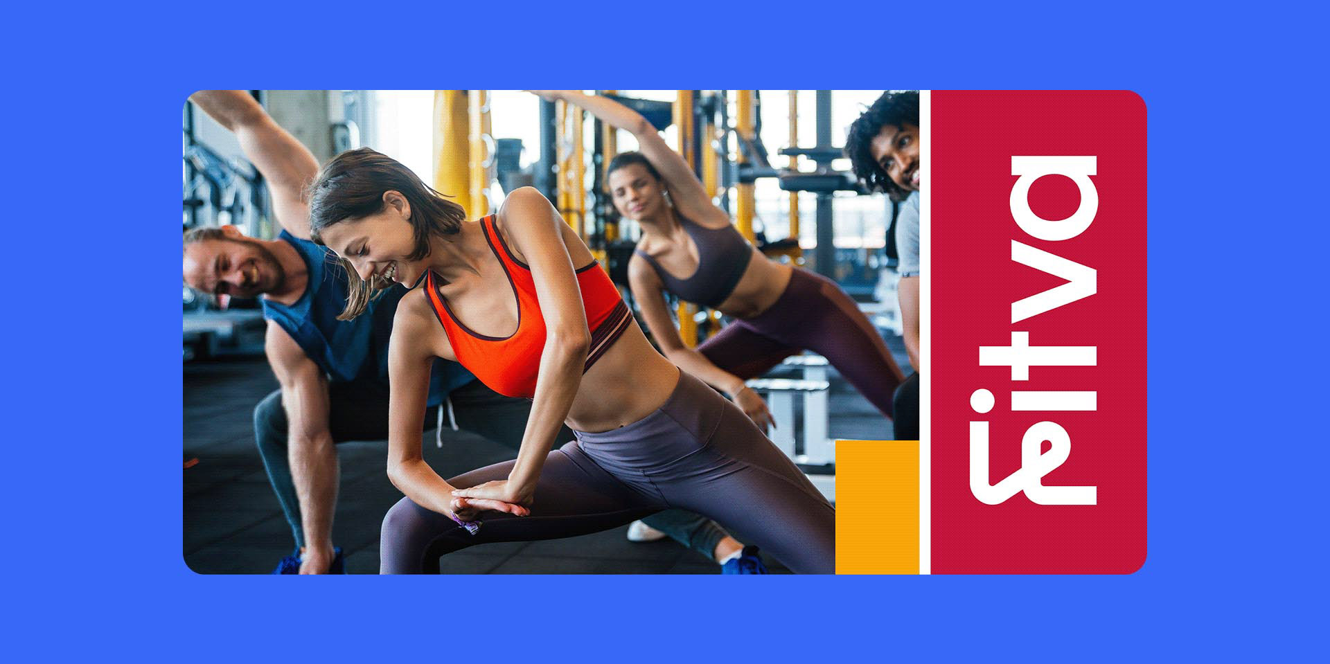
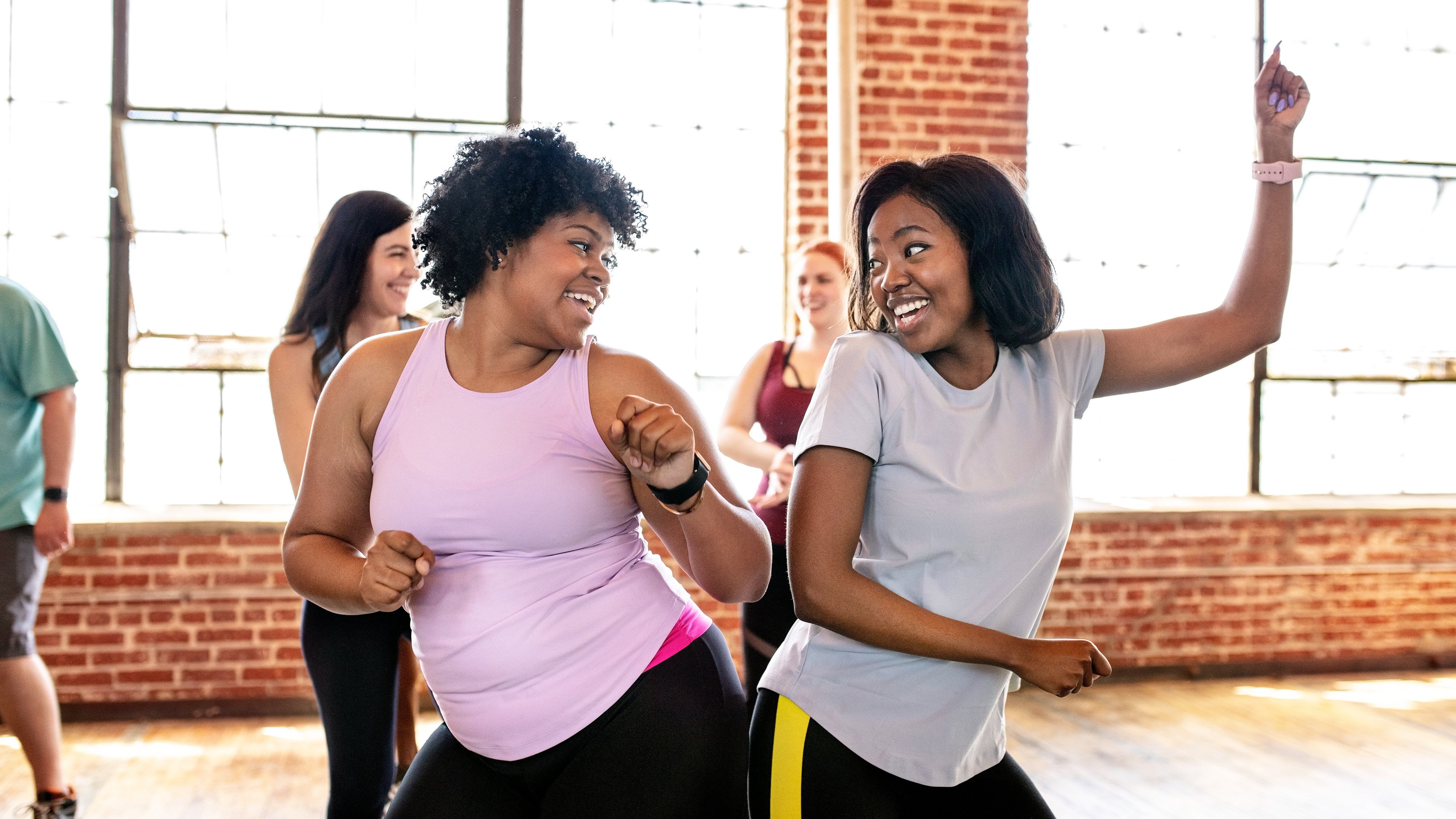
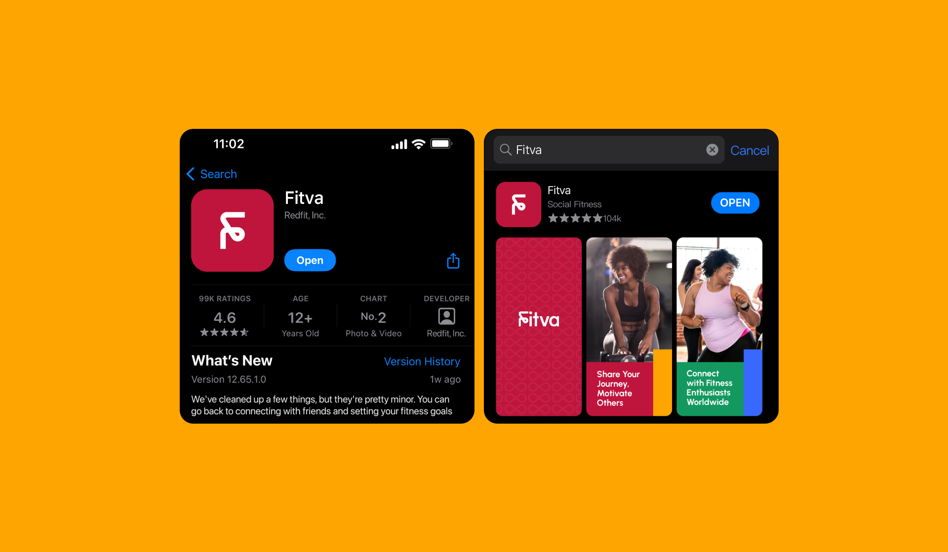
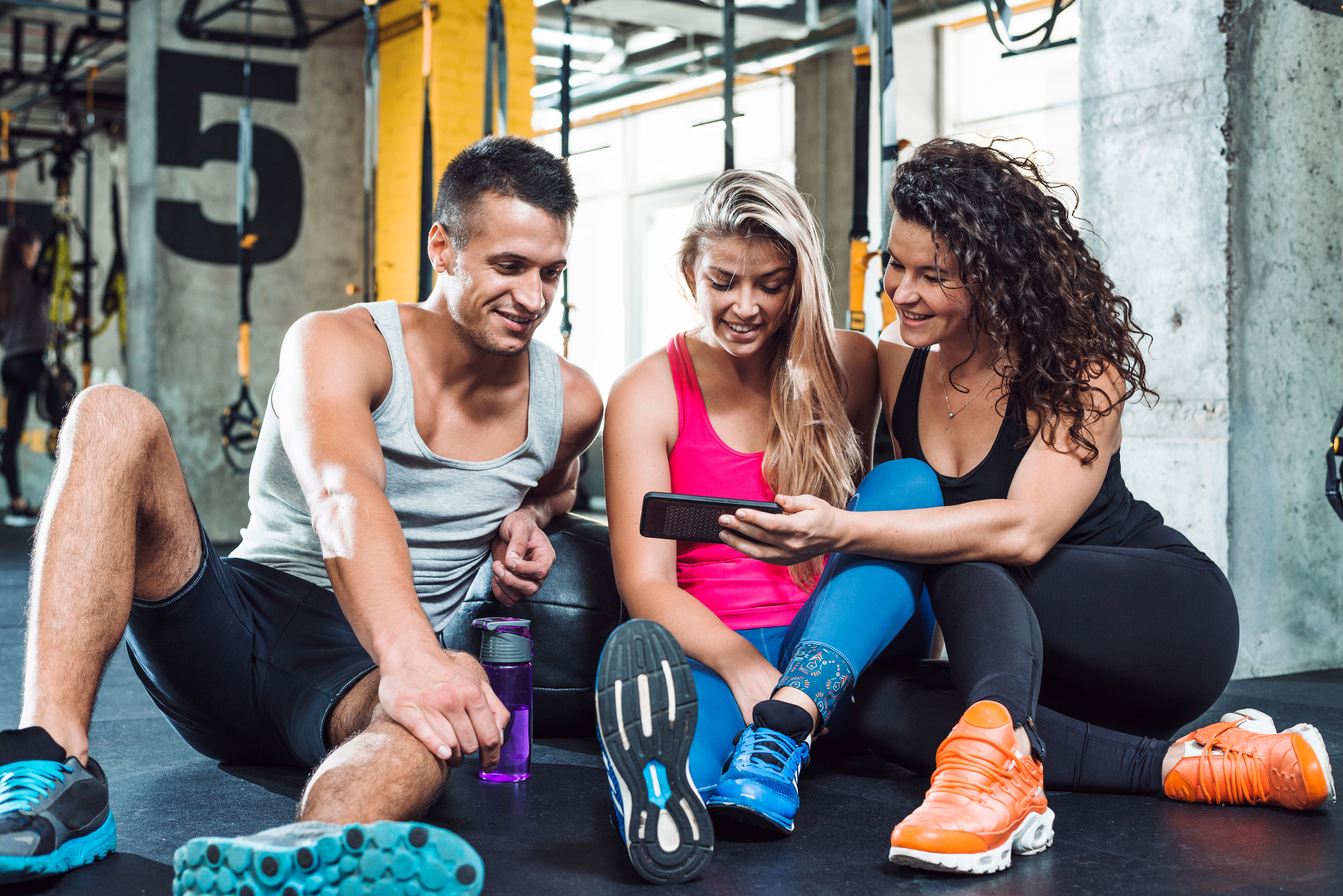
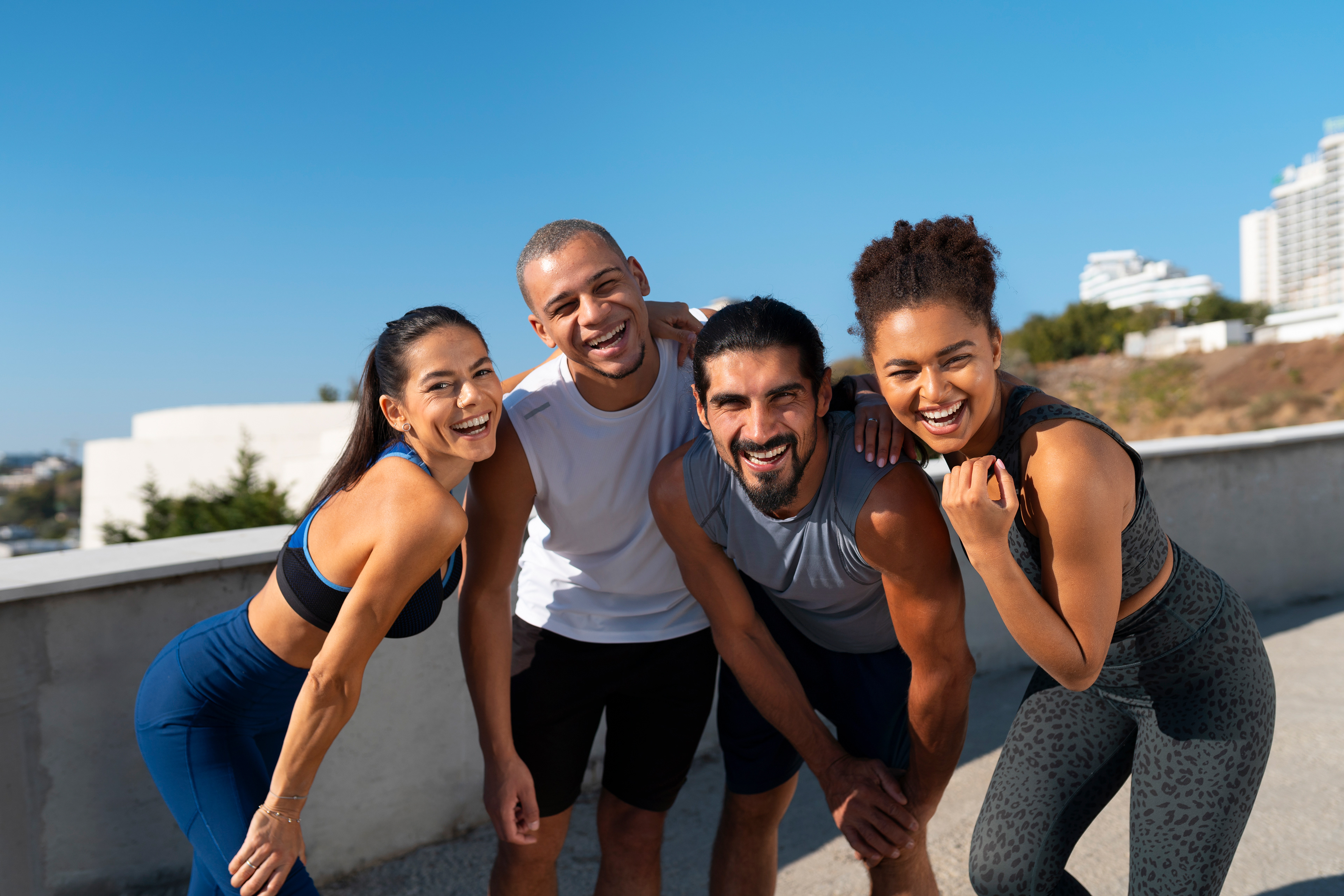
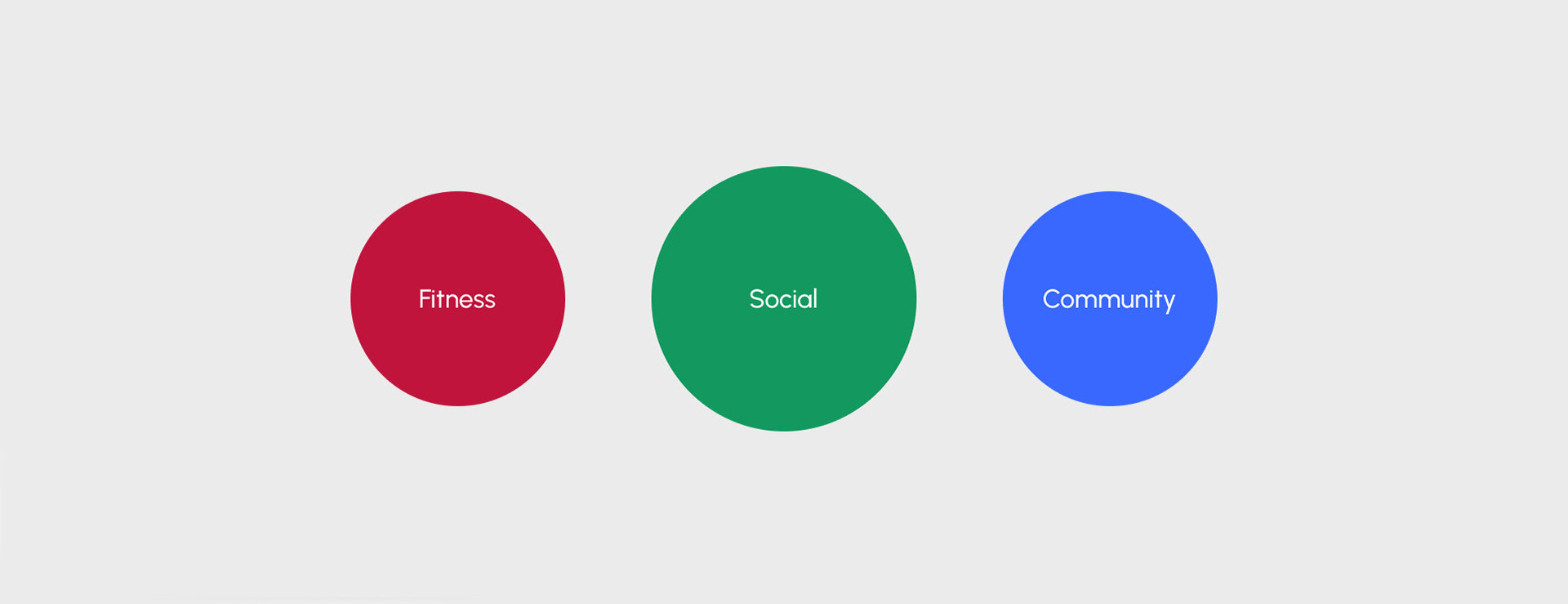
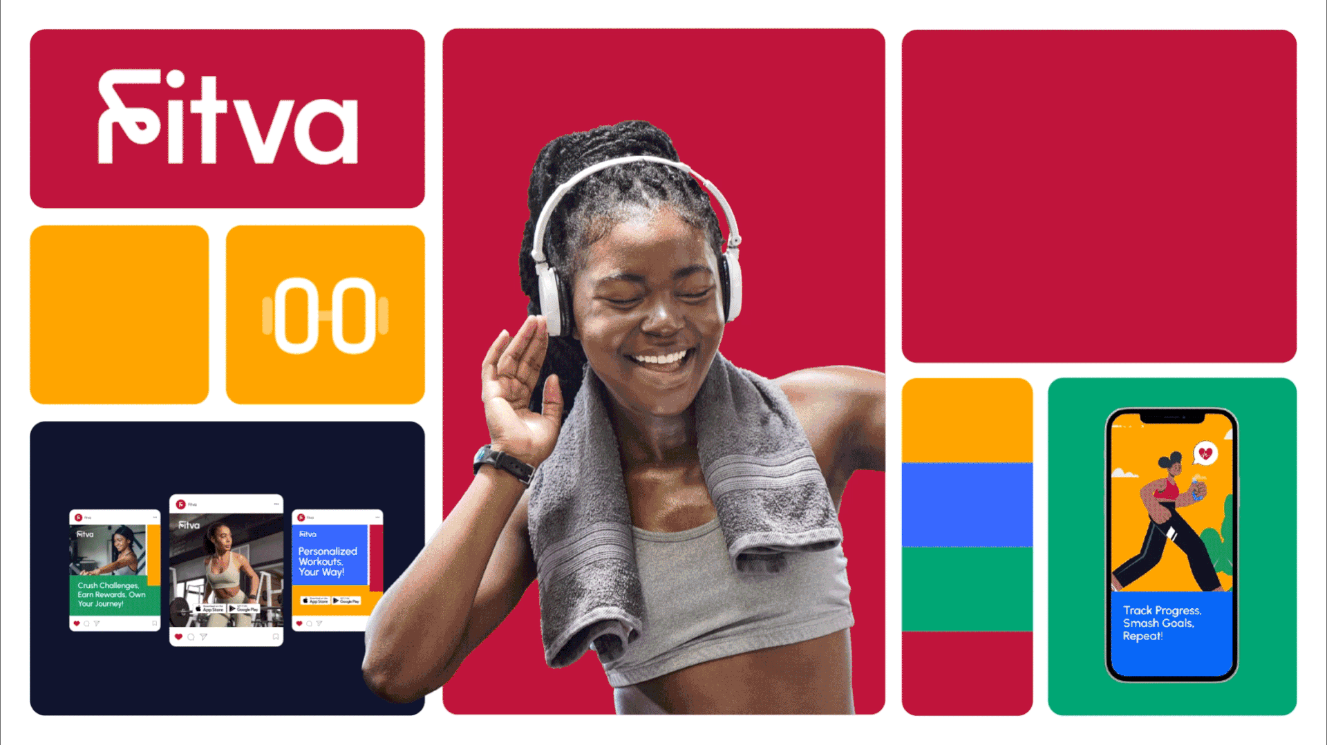
Fitva is a groundbreaking social fitness app that leverages communities, tapping into social media dynamics to make achieving health and fitness goals enjoyable. Users share experiences, tips, and motivation through these communities, fostering a supportive environment. It takes a holistic approach, providing tools for workouts, nutrition, and mindfulness.
The app incorporates gamification, adding excitement and incentivizing users to stay consistent. With inclusivity in mind, Fitva caters to all fitness levels, making it a comprehensive lifestyle companion that transcends traditional health products.
Approach to Branding
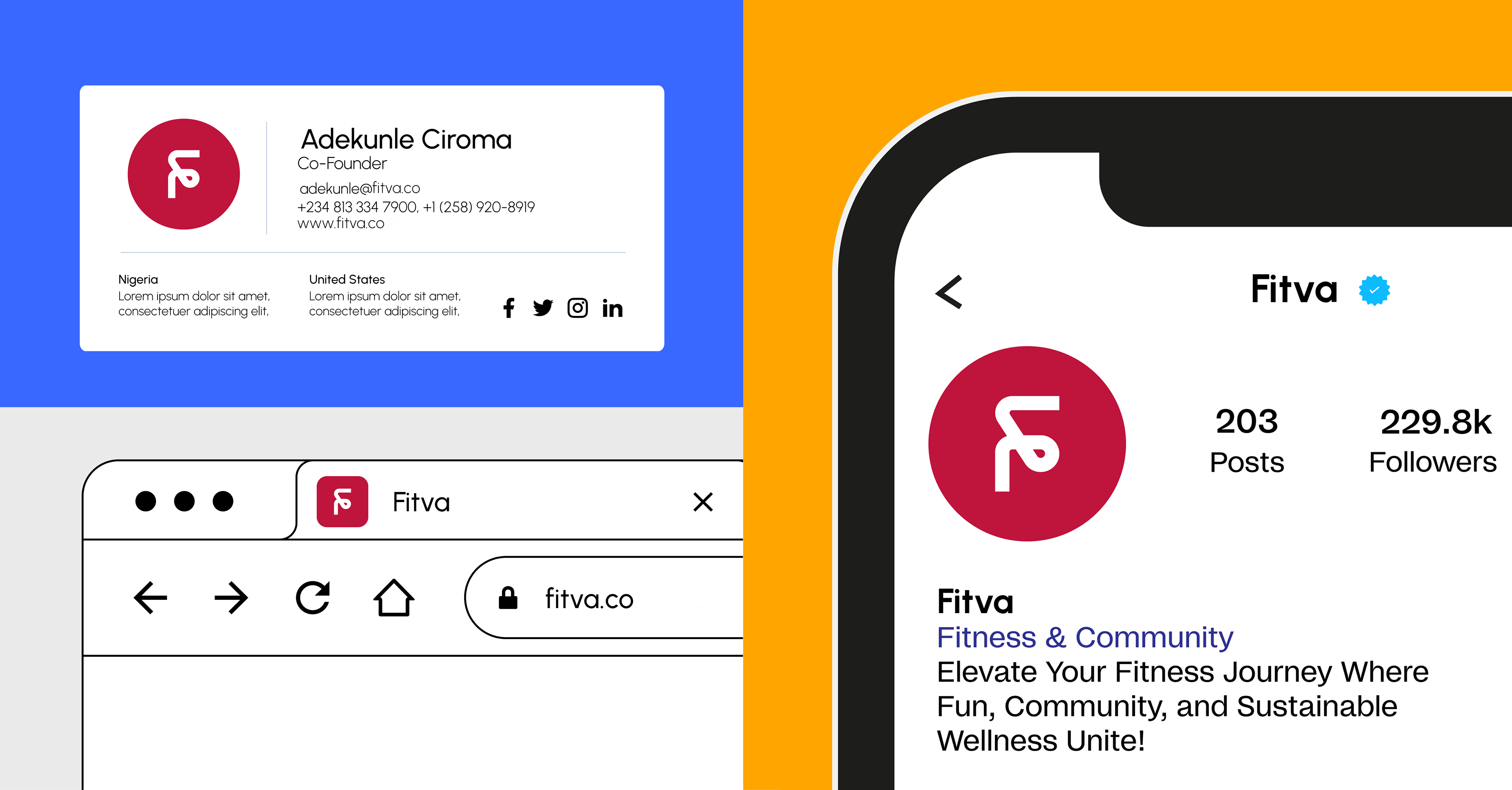
It is not just a fitness app; it's a lifestyle movement. The idea is to create a digital space where individuals unite to inspire, motivate, and celebrate each other's fitness achievements. Through cutting-edge technology, social connectivity, and comprehensive wellness resources, Fitva empowers users to embrace a healthier and happier version of themselves.
It is not just a fitness app; it's a lifestyle movement. The idea is to create a digital space where individuals unite to inspire, motivate, and celebrate each other's fitness achievements. Through cutting-edge technology, social connectivity, and comprehensive wellness resources, Fitva empowers users to embrace a healthier and happier version of themselves.
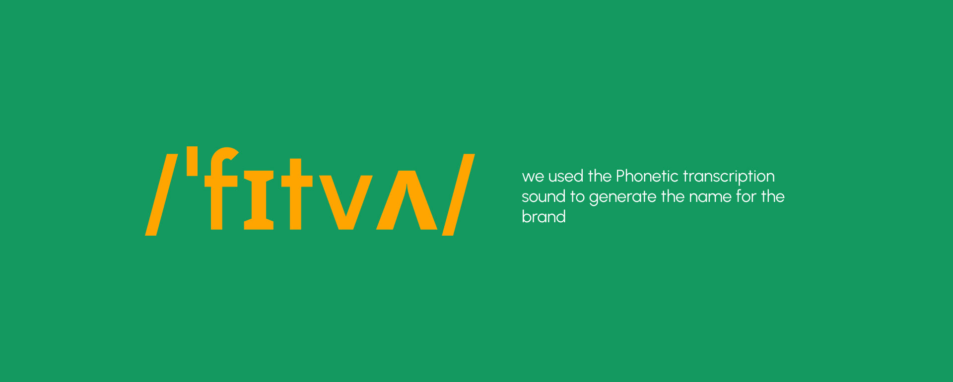
After brainstorming several names that capture the spirit of community and wellness, we chose Fitva—a blend of "Fitness" and "Vibe." This name reflects our focus on both physical health and the inspiring atmosphere we create together.
Why Fitva?
Memorability: It is short, snappy, and easy to recall in a crowded market.
Distinctive Sound: The unique pronunciation (/ˈfɪtvʌ/) sparks curiosity and sets us apart.
A Harmonious Blend: It perfectly bridges the gap between structured exercise and the "vibe"—the feeling of being inspired by your environment.
Positive Energy: The name carries an upbeat connotation, suggesting that fitness should be an enjoyable, uplifting journey rather than a chore.
Versatility: Its broad appeal works across all app features, from intense workouts to social community building.
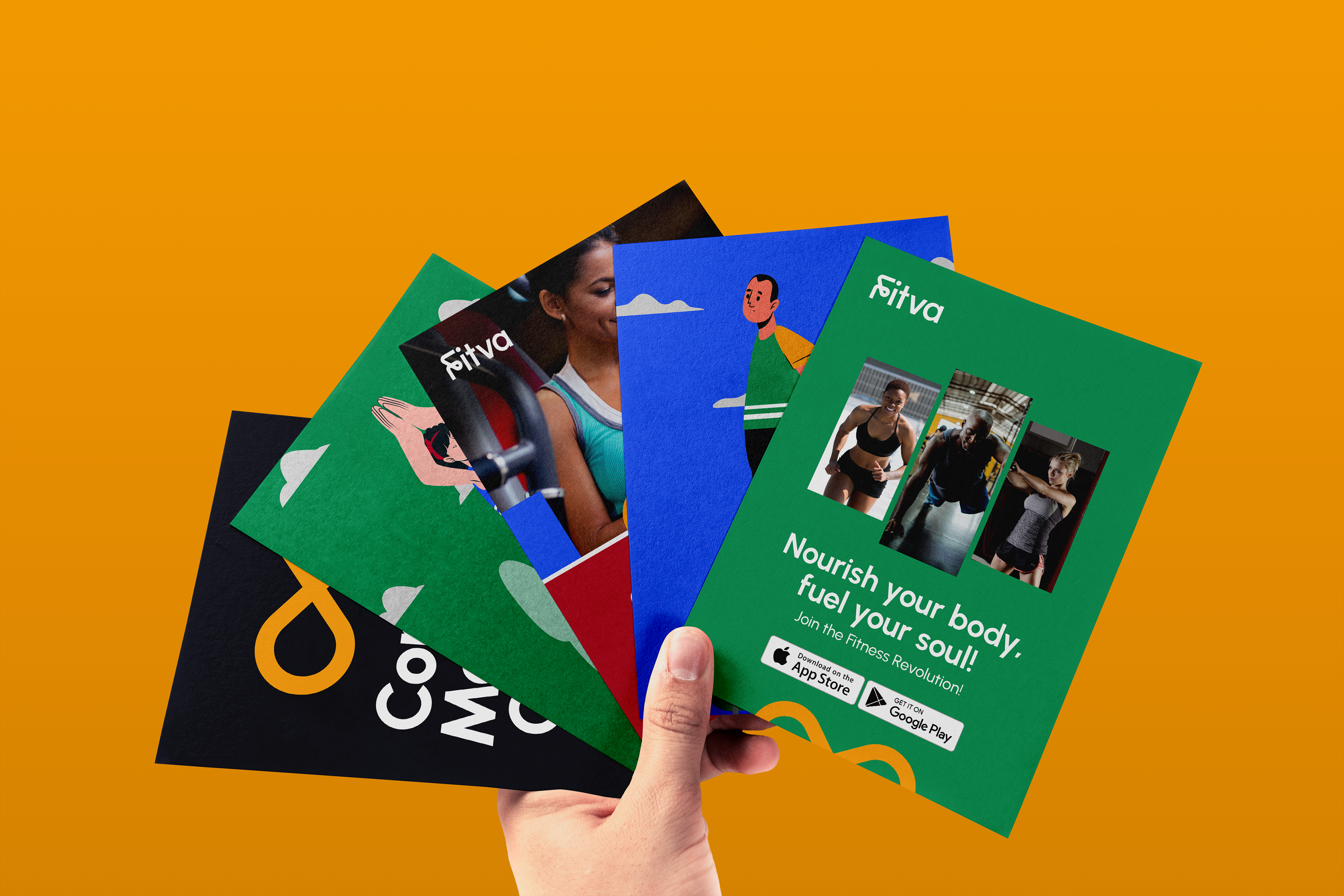
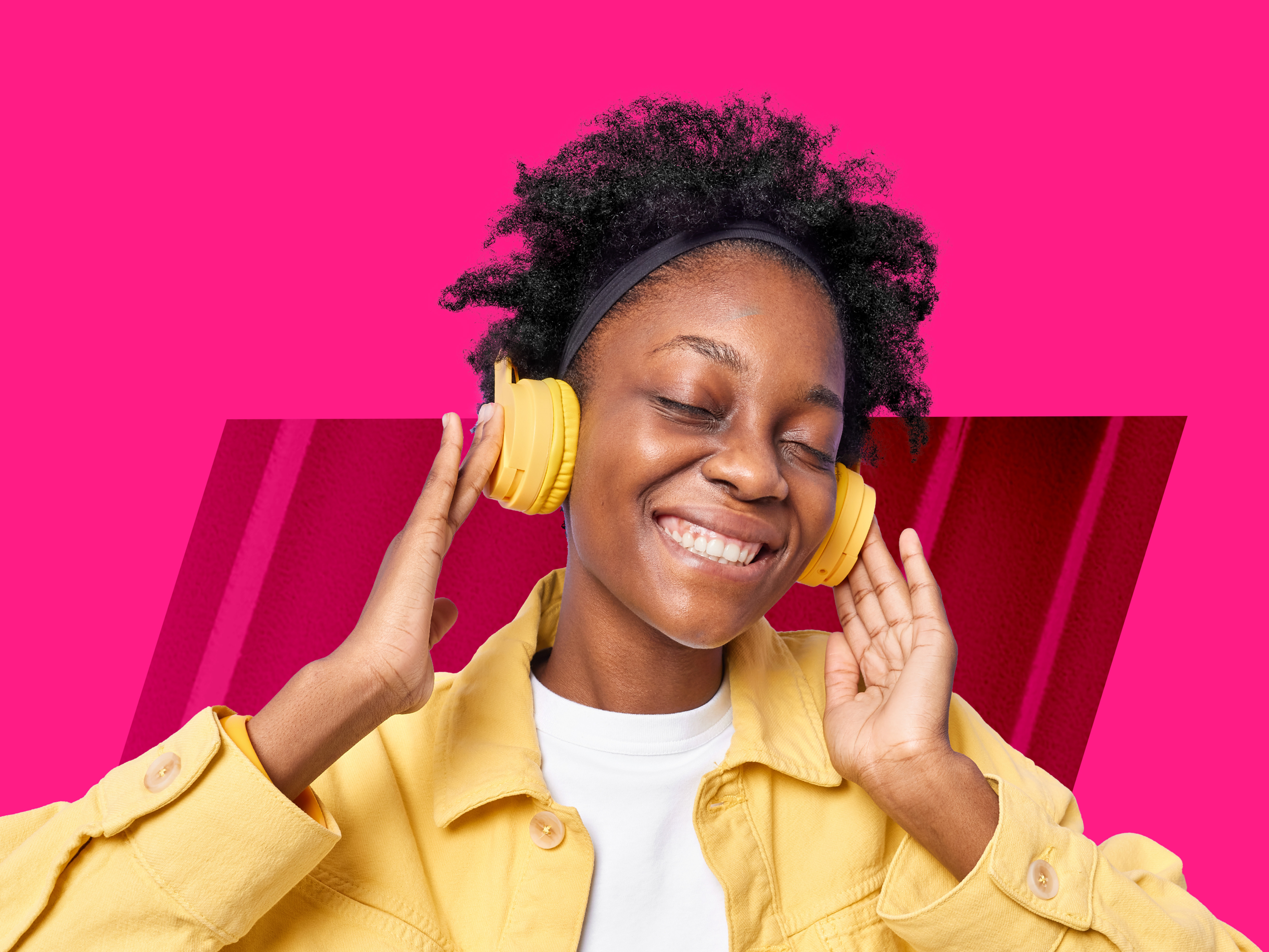
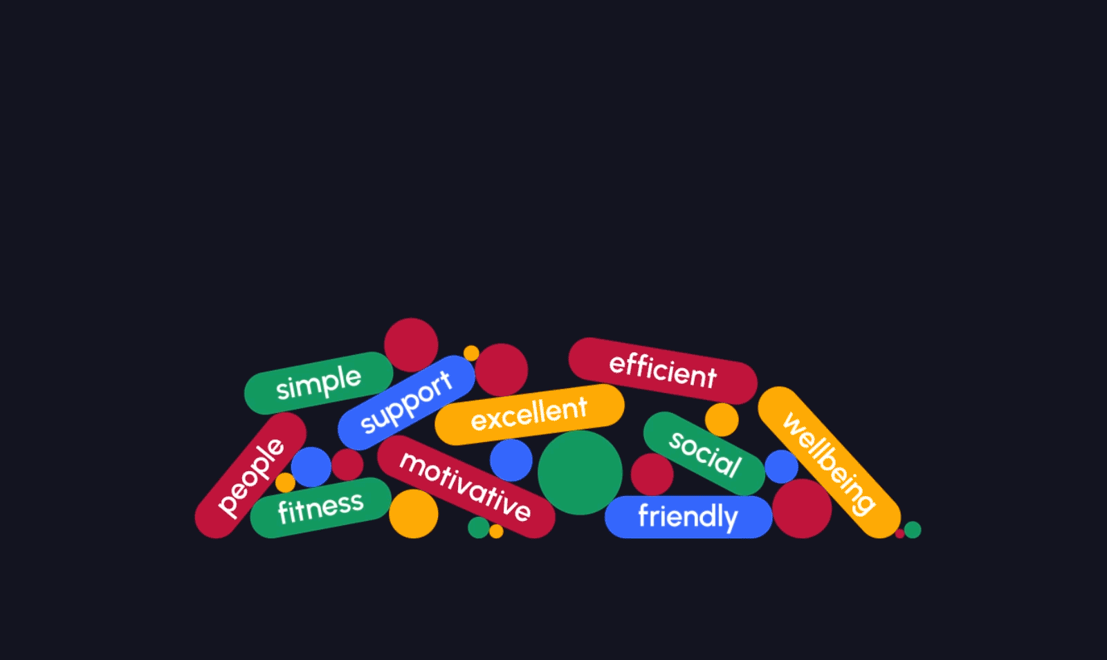
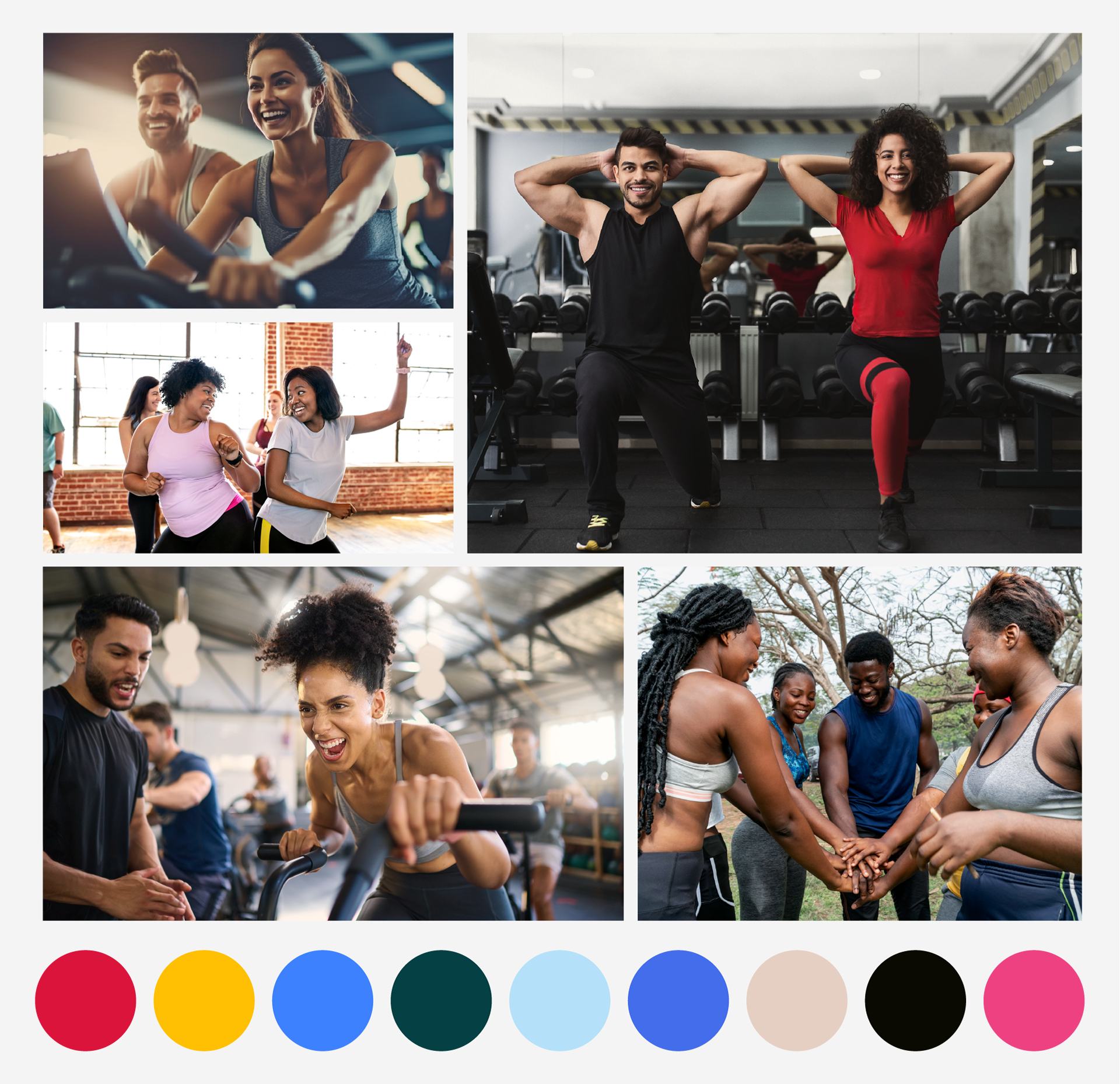
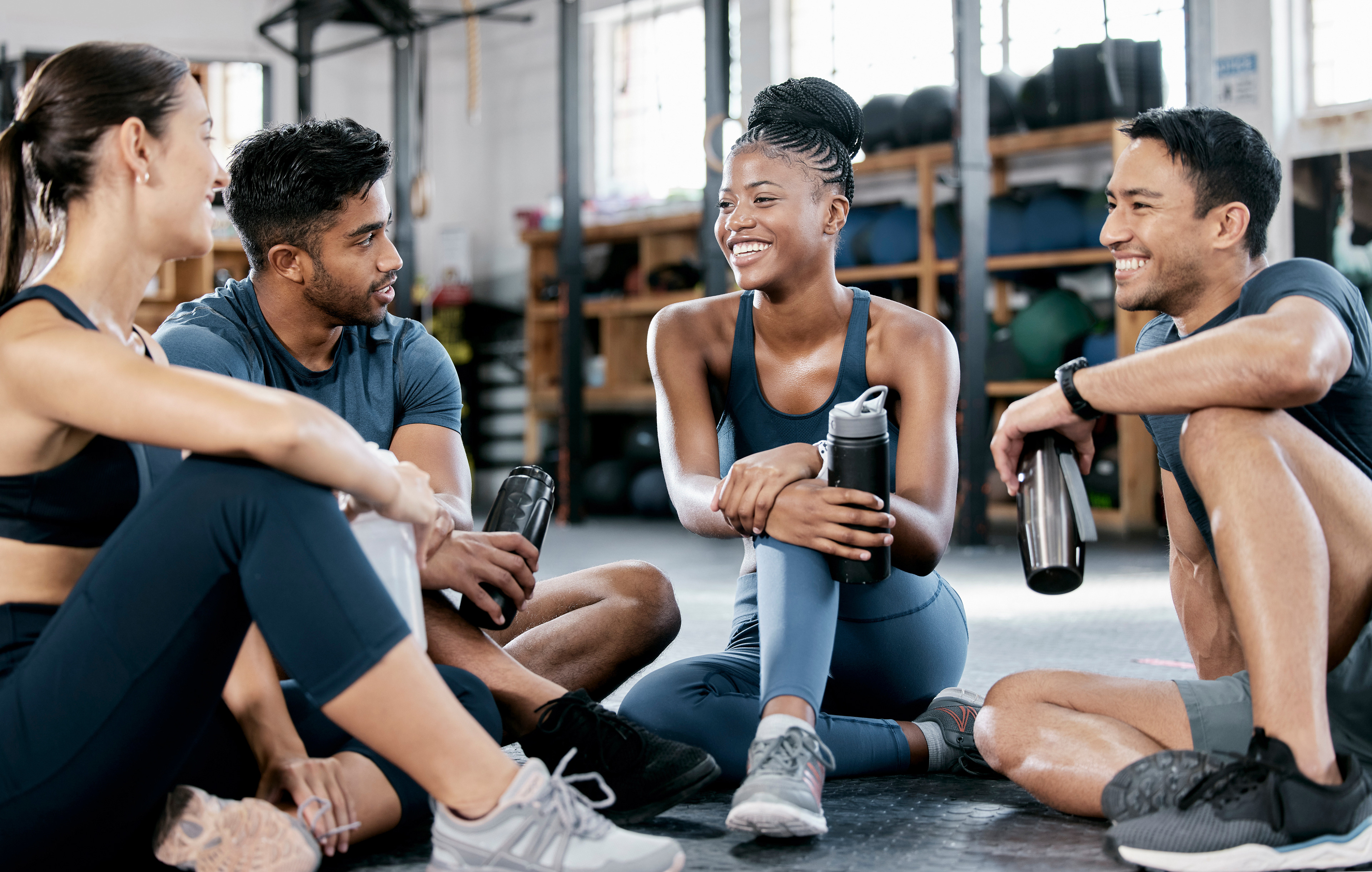
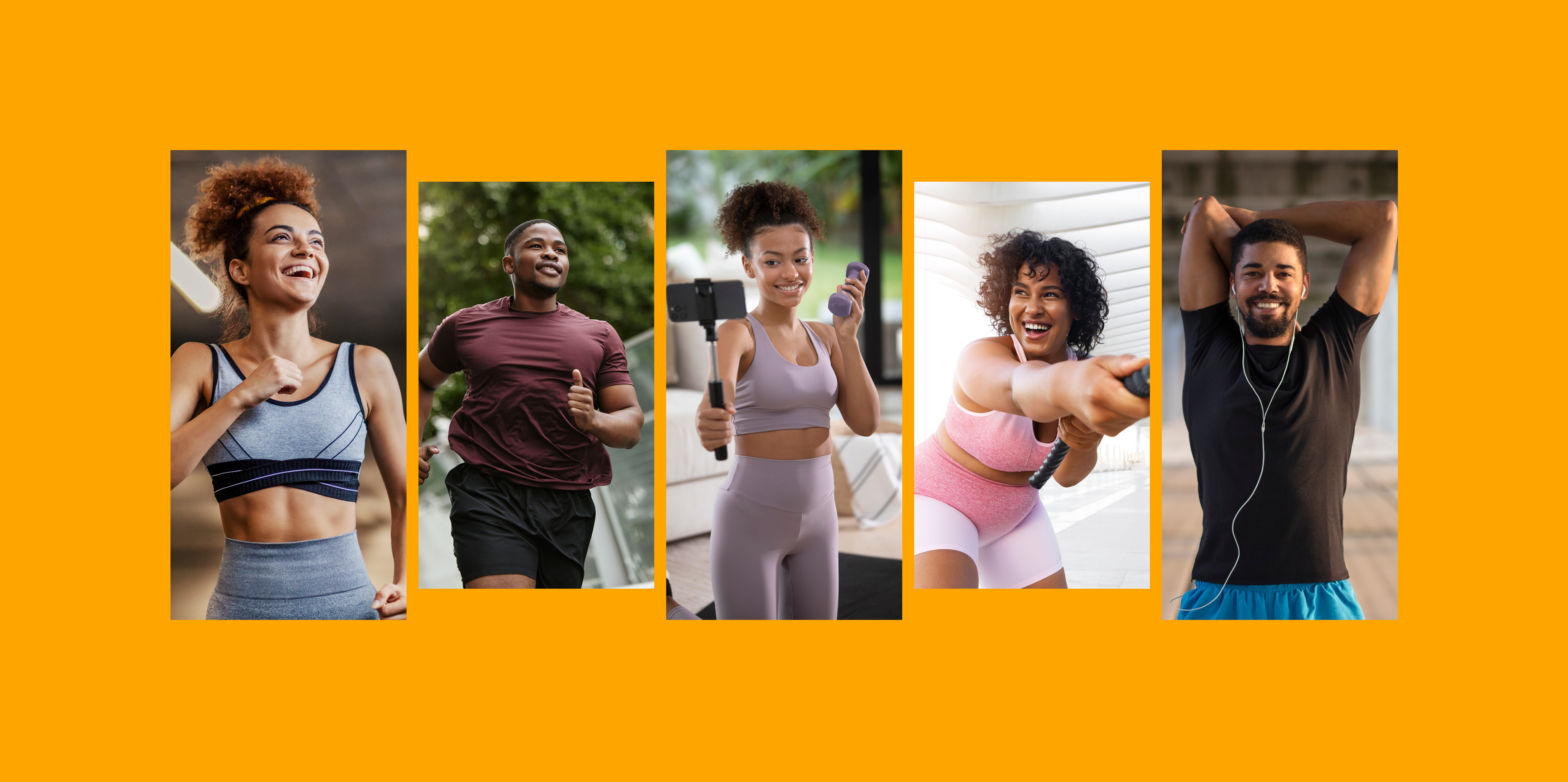
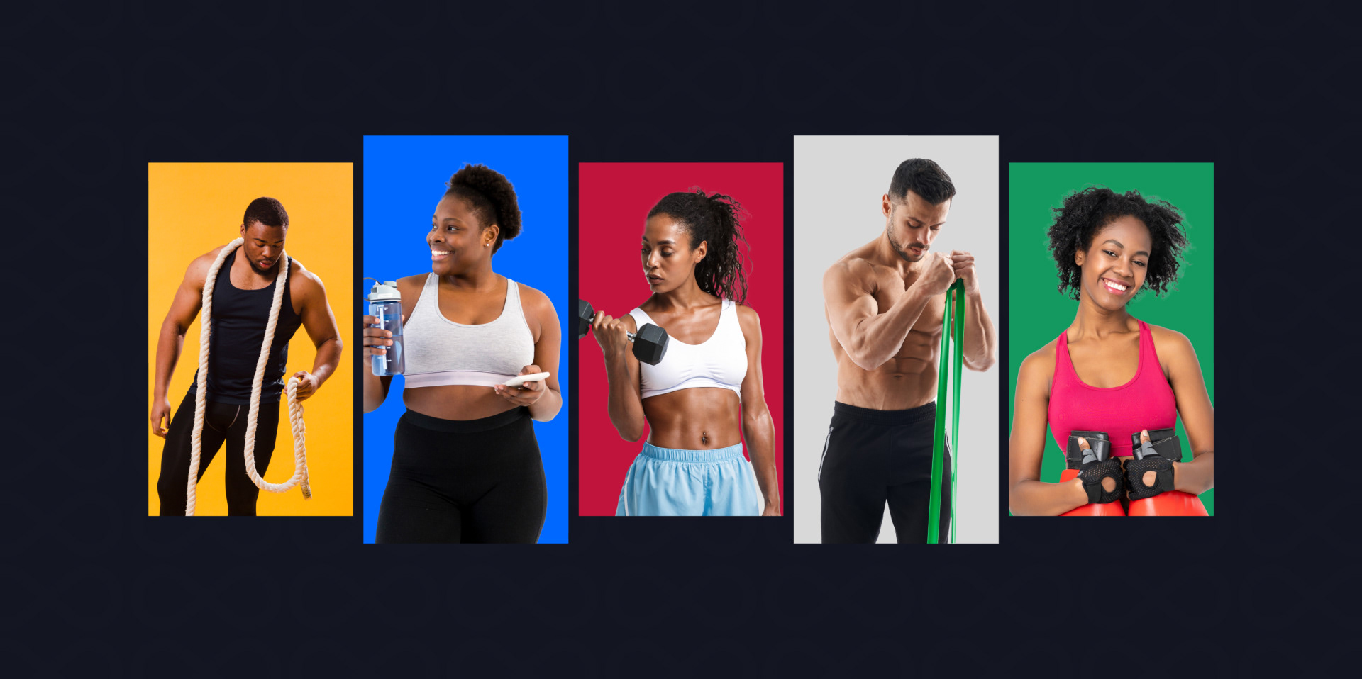
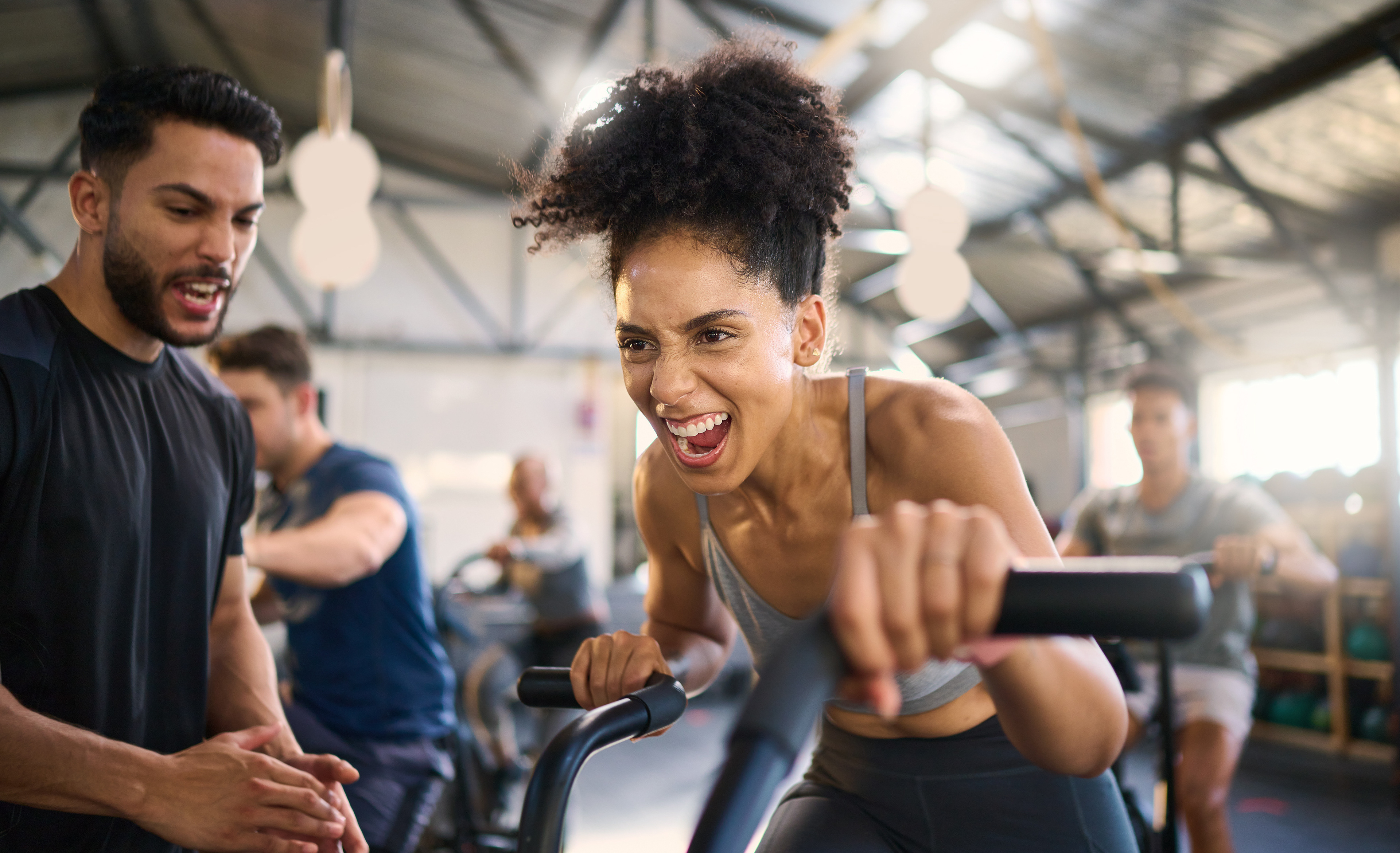
Our moodboard features a diverse group of people engaged in workouts and celebratory moments, paired with motivational quotes and a vibrant, energetic color palette. The visual style is grounded by modern, sleek typography to create a balanced sense of innovation and sophistication.
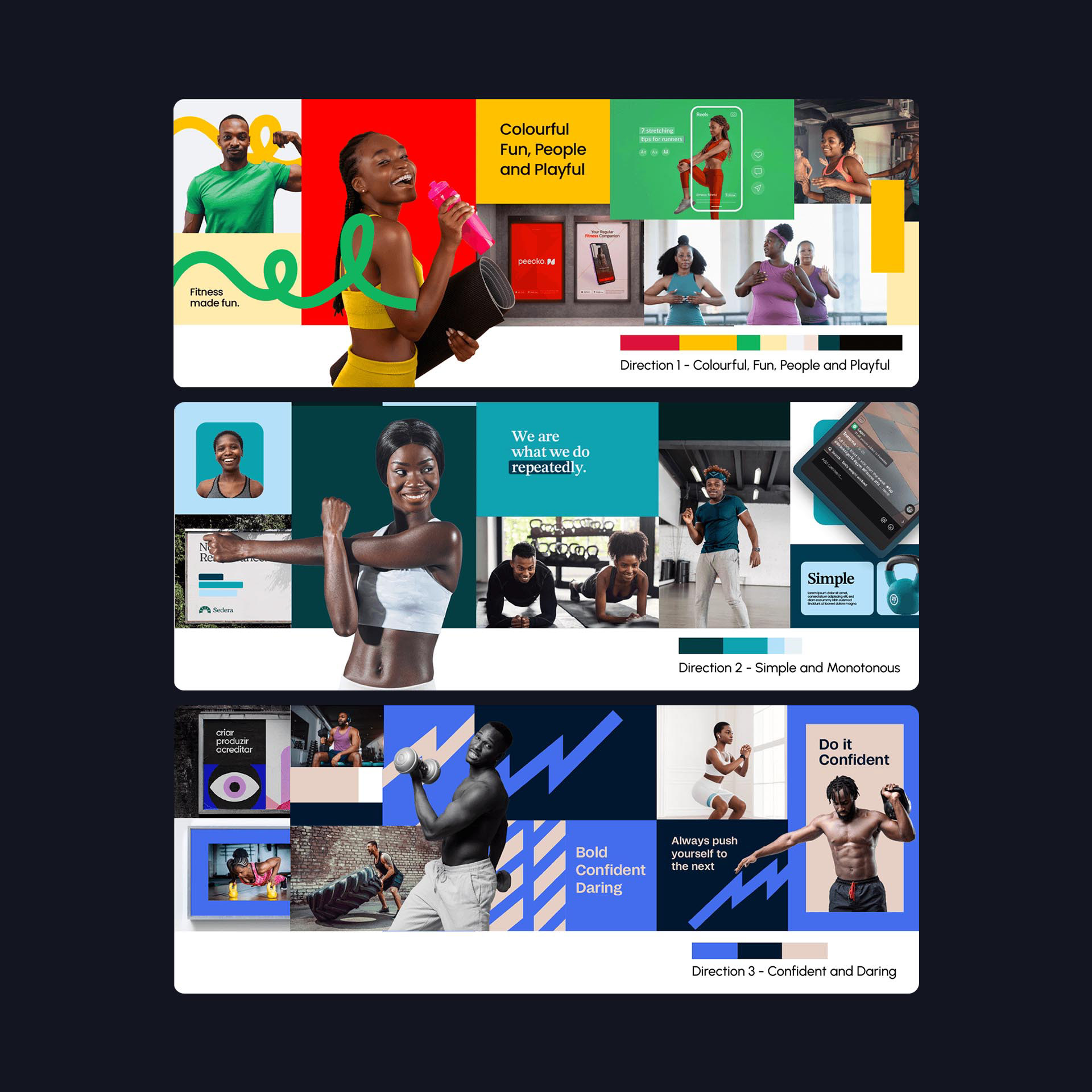
When we thought about how this project should look and feel, we came up with three main ideas. Each idea has its own mood and vibe.
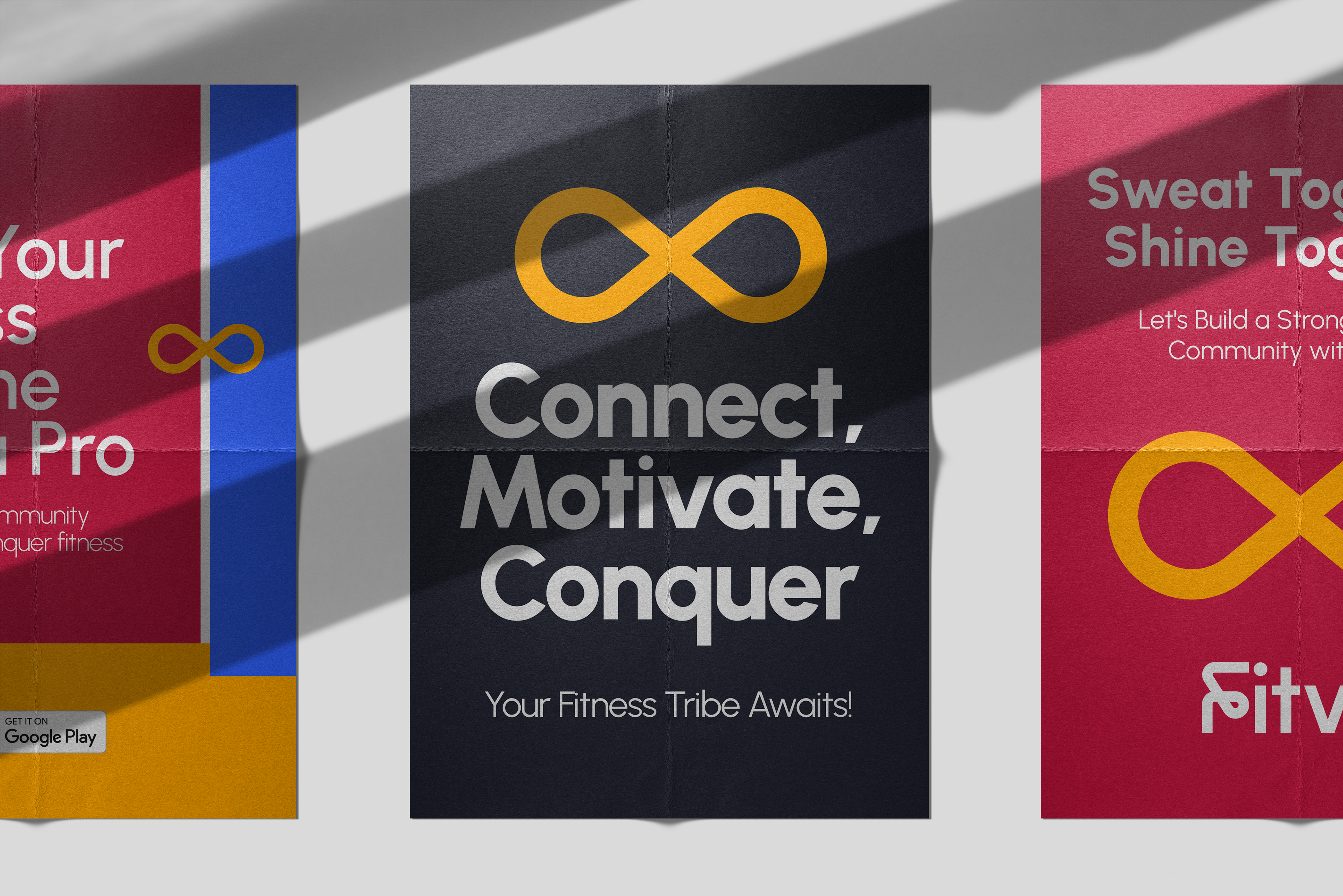
The first idea is all about being Colorful, Fun, and Playful. We'd use many bright colors and bold patterns to make things lively and exciting. The pictures would show people having a great time, and we'd use playful fonts and inspiring quotes to keep things upbeat.
The second idea is about keeping things Simple and Monotonous. We'd use soft, neutral colors and simple designs to create a peaceful feeling. The pictures would be clean and uncomplicated, focusing on everyday moments. We want to show that beauty can be found in simplicity.
The third idea is all about Confidence and Daring. We'd use strong colors like blue and deep navy, along with bold patterns and textures to make a statement. The pictures would be powerful and dynamic, showing strength and determination. We'd use bold fonts and sharp shapes to convey a sense of authority.
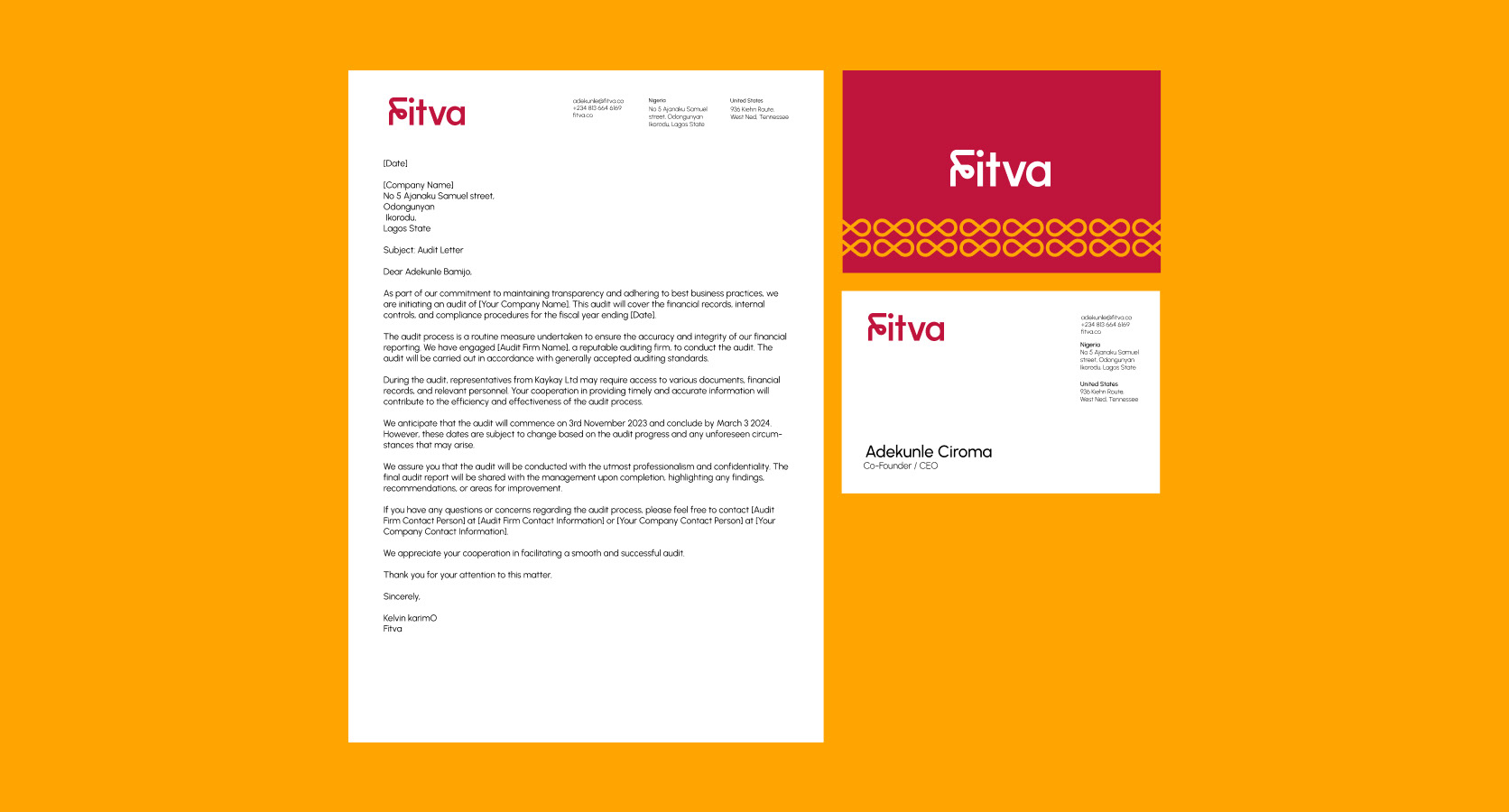
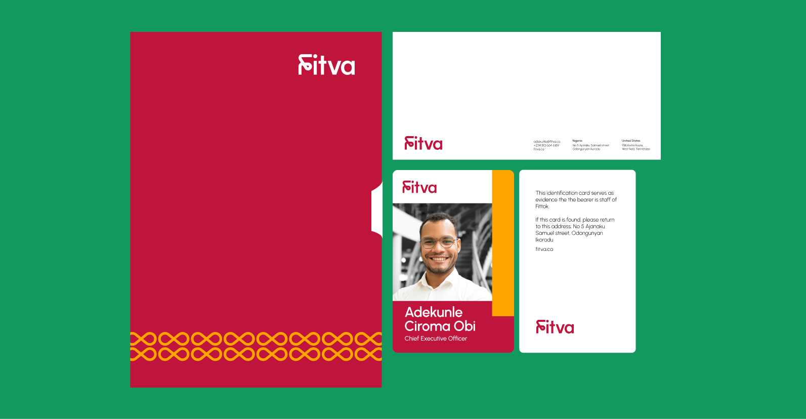
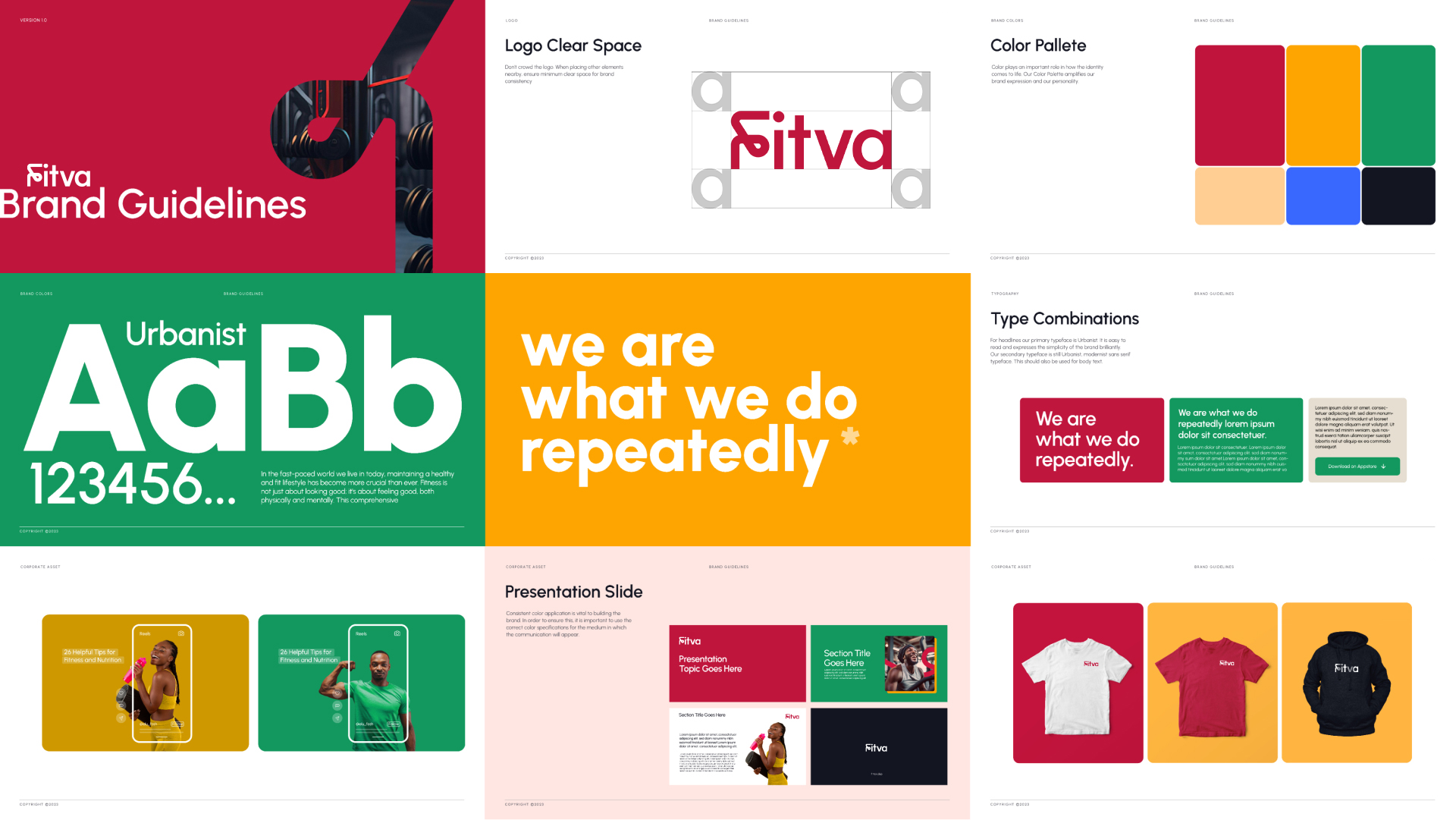
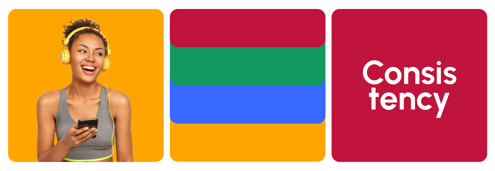
This Project involved an extensive design exploration to identify Fitva's primary product offerings. We engaged in various logo prototypes, intending to create memorable icons, and swiftly gravitated towards a design that signifies continuity and consistency. Additionally, we explored diverse brand elements to enhance the welcoming ambiance complementing the chosen logo.
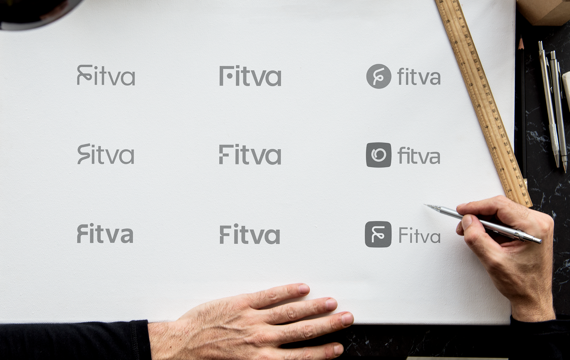
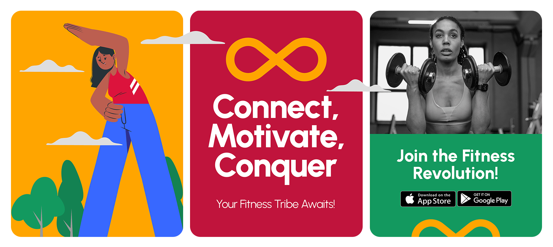
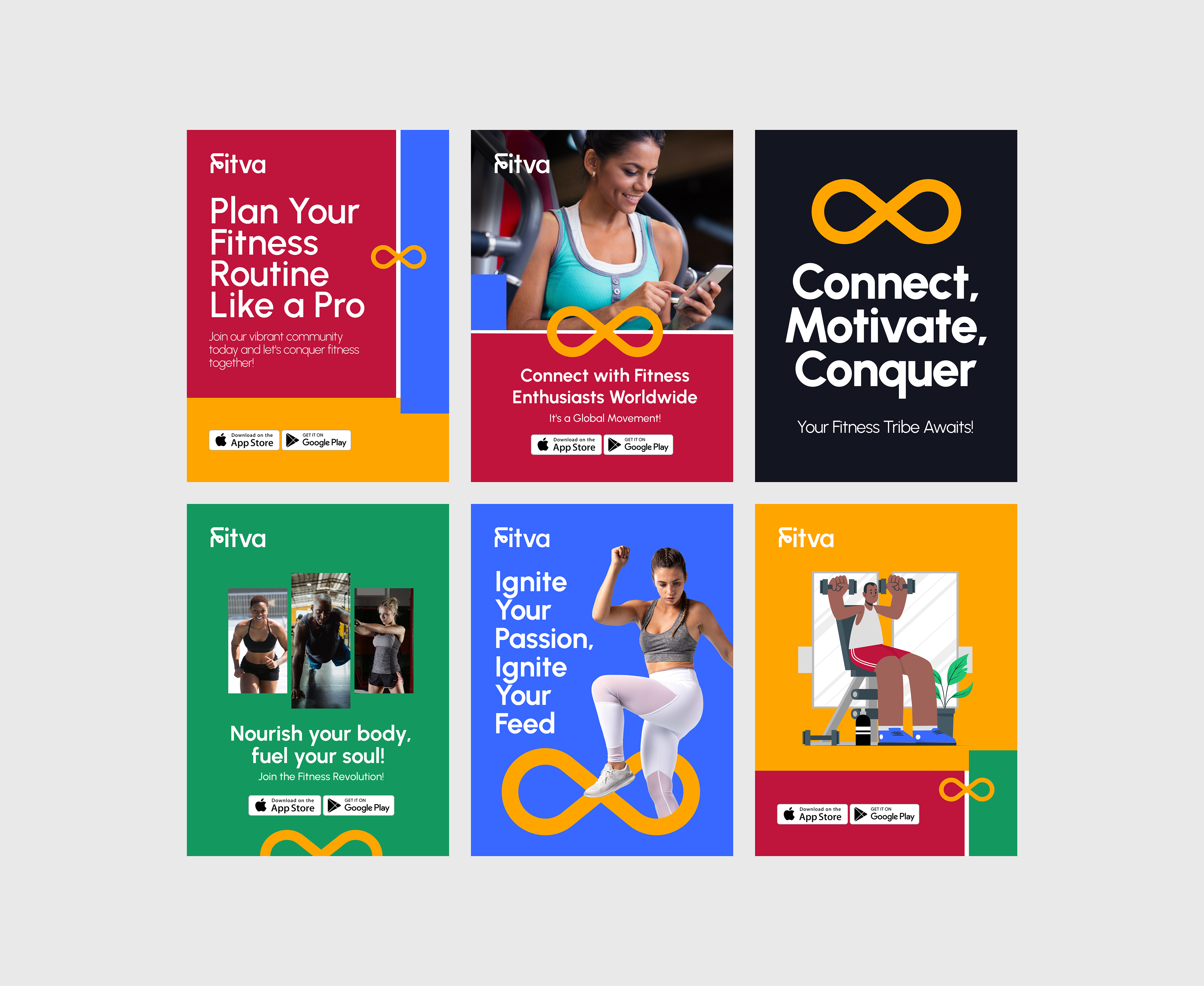
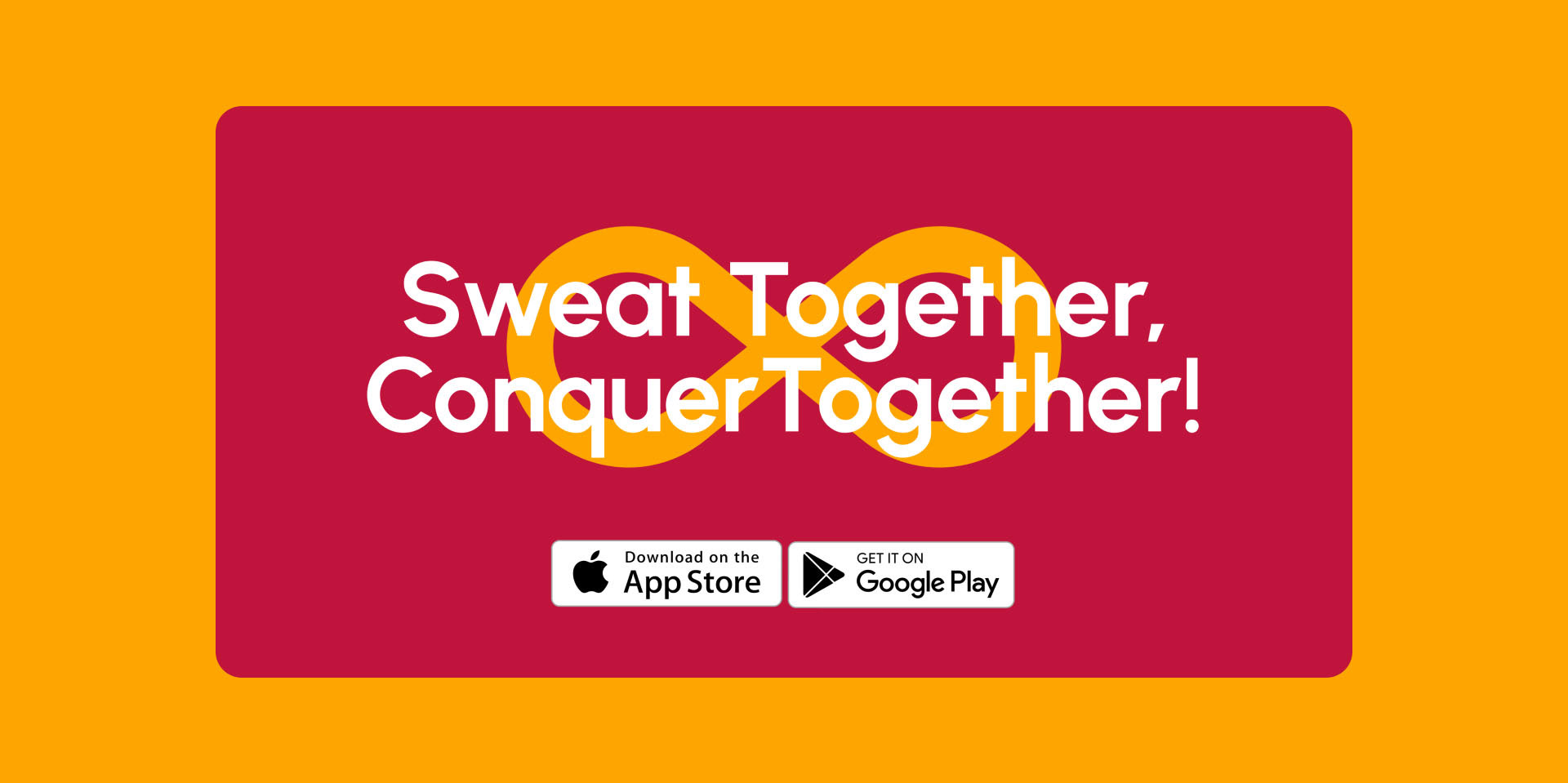
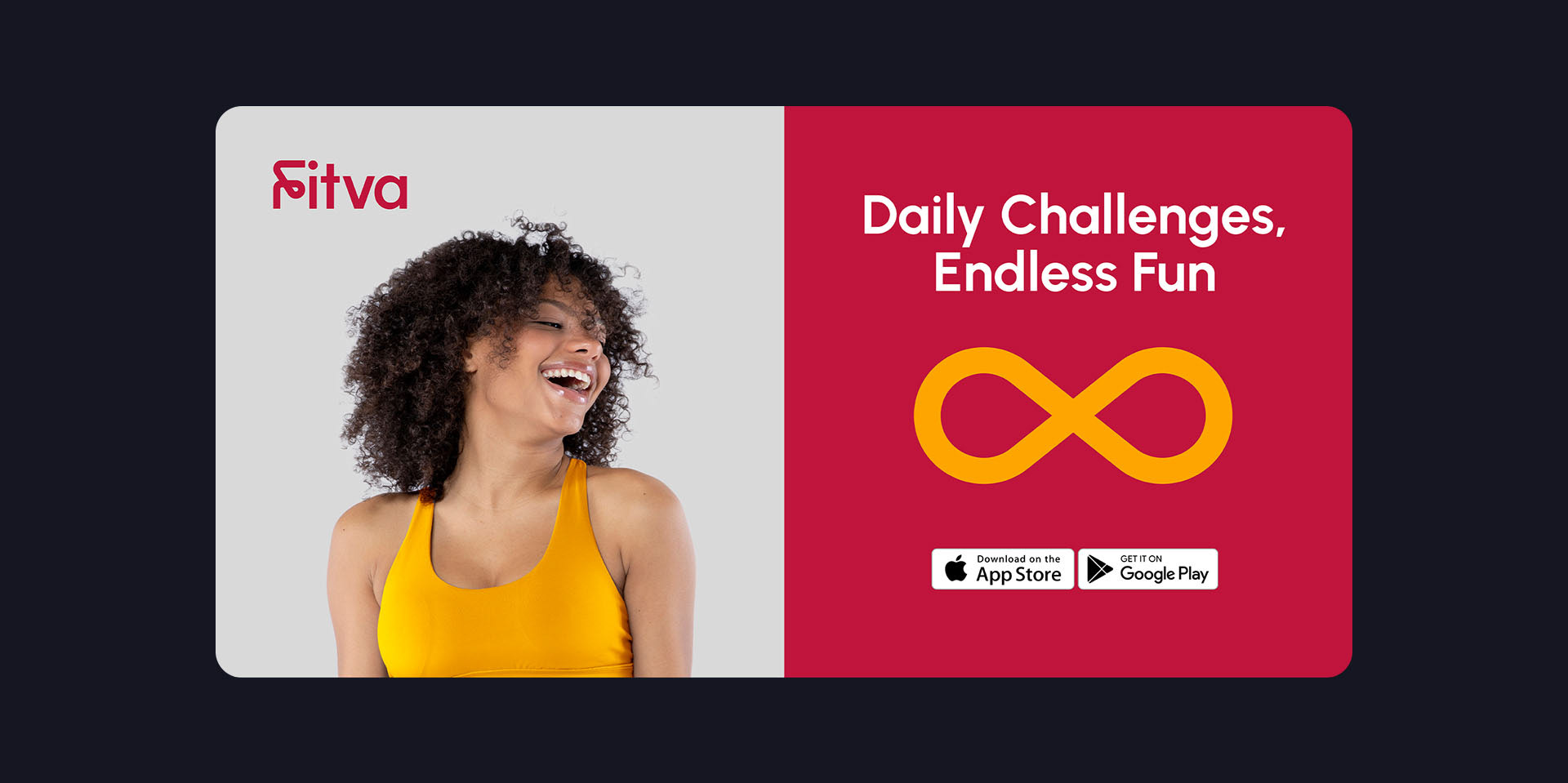
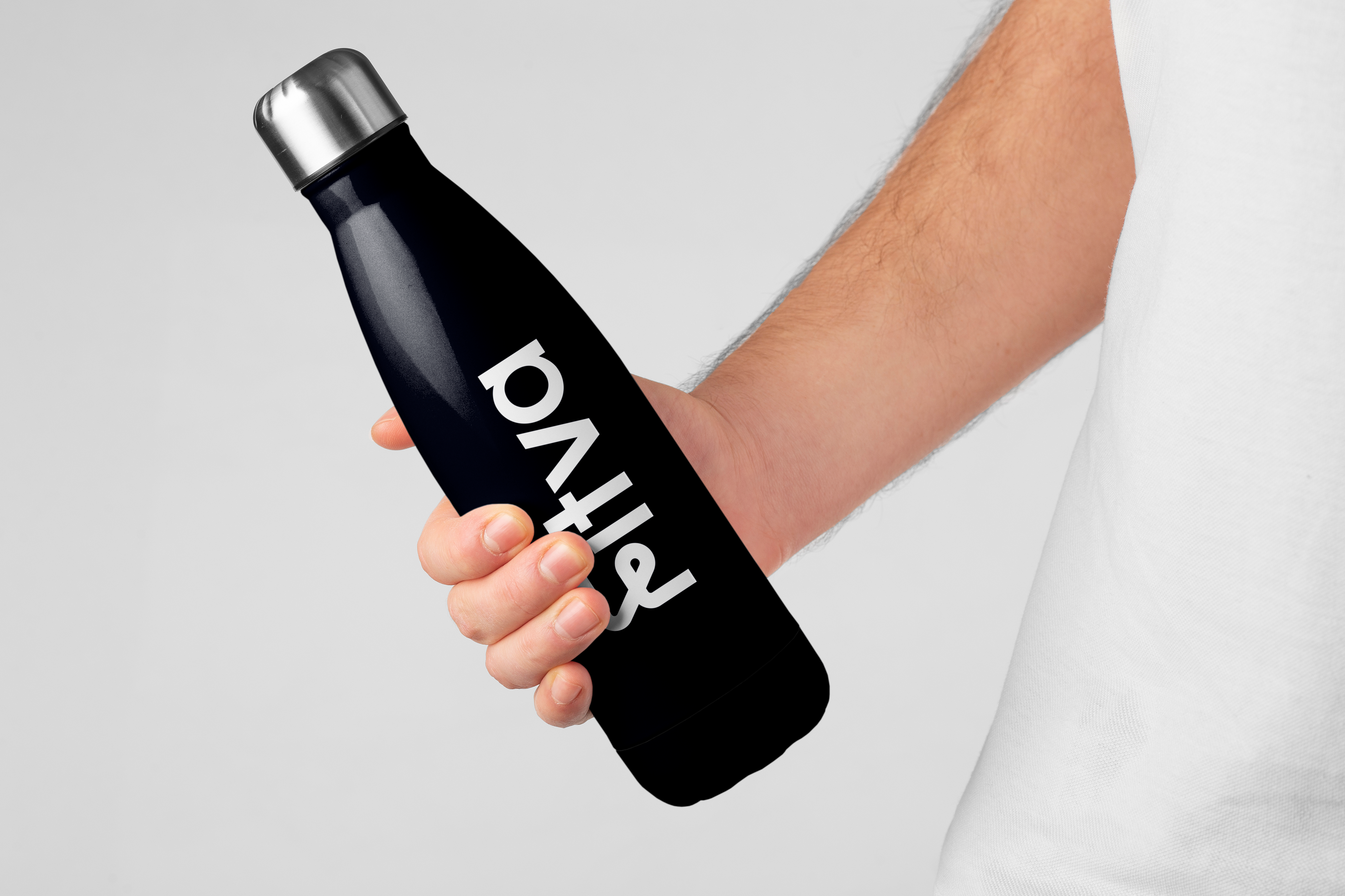
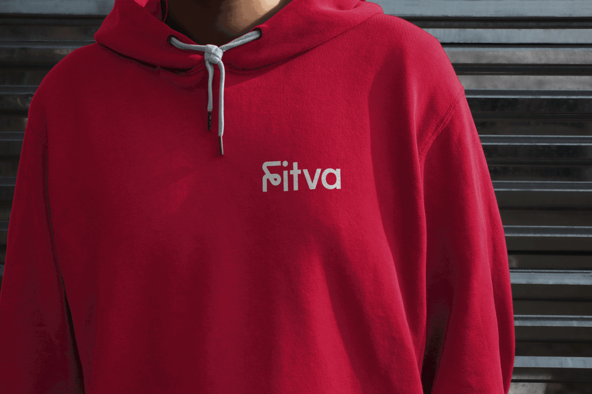
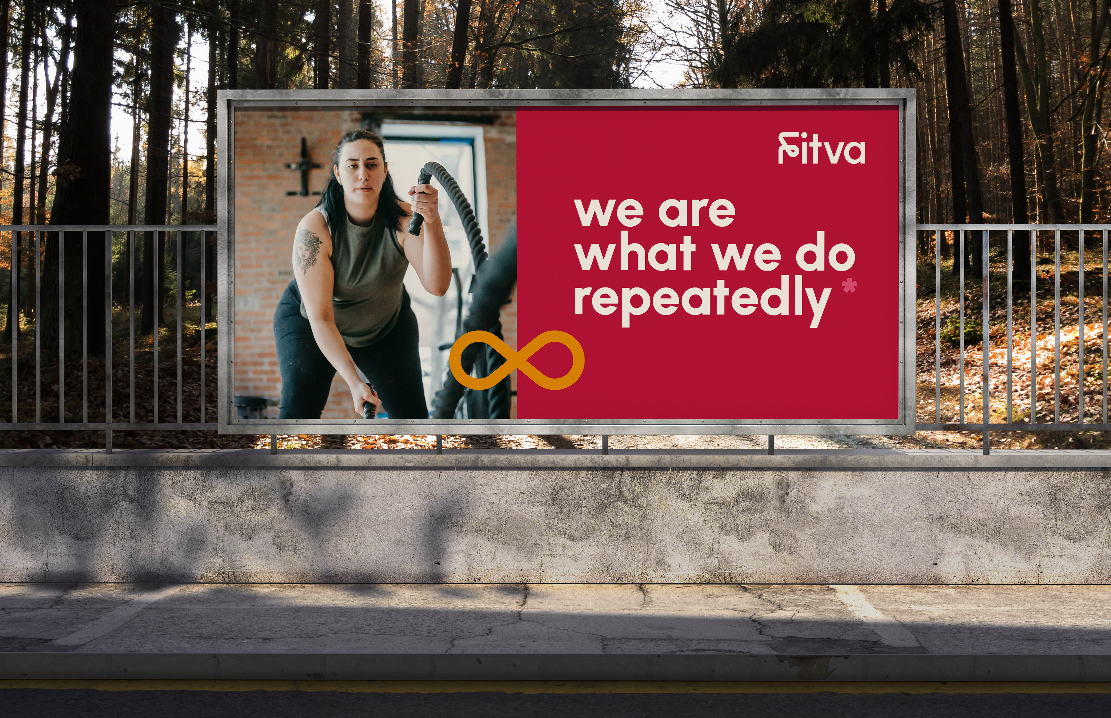
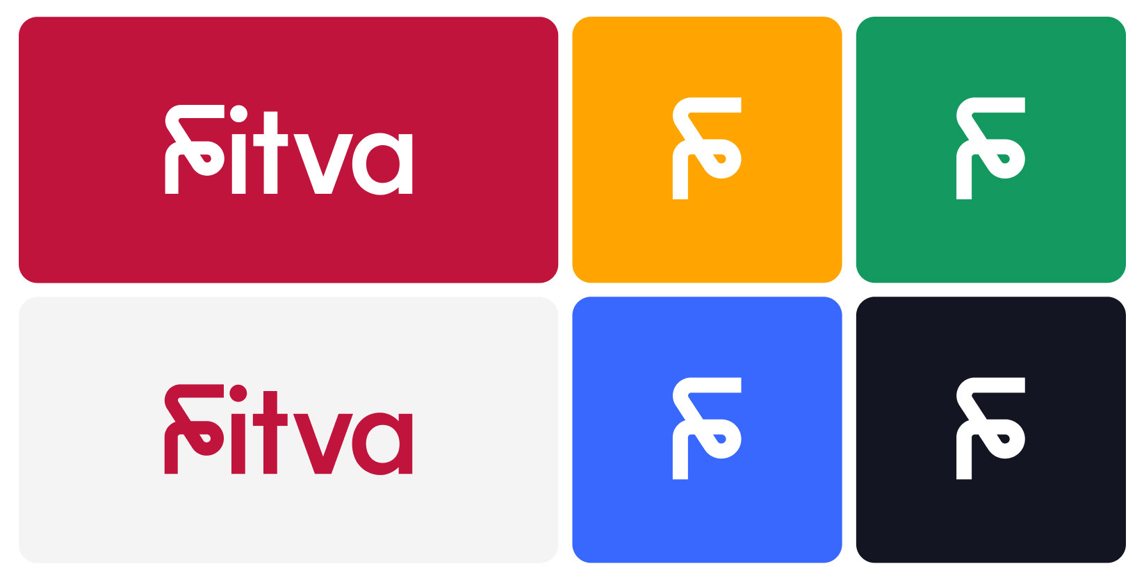
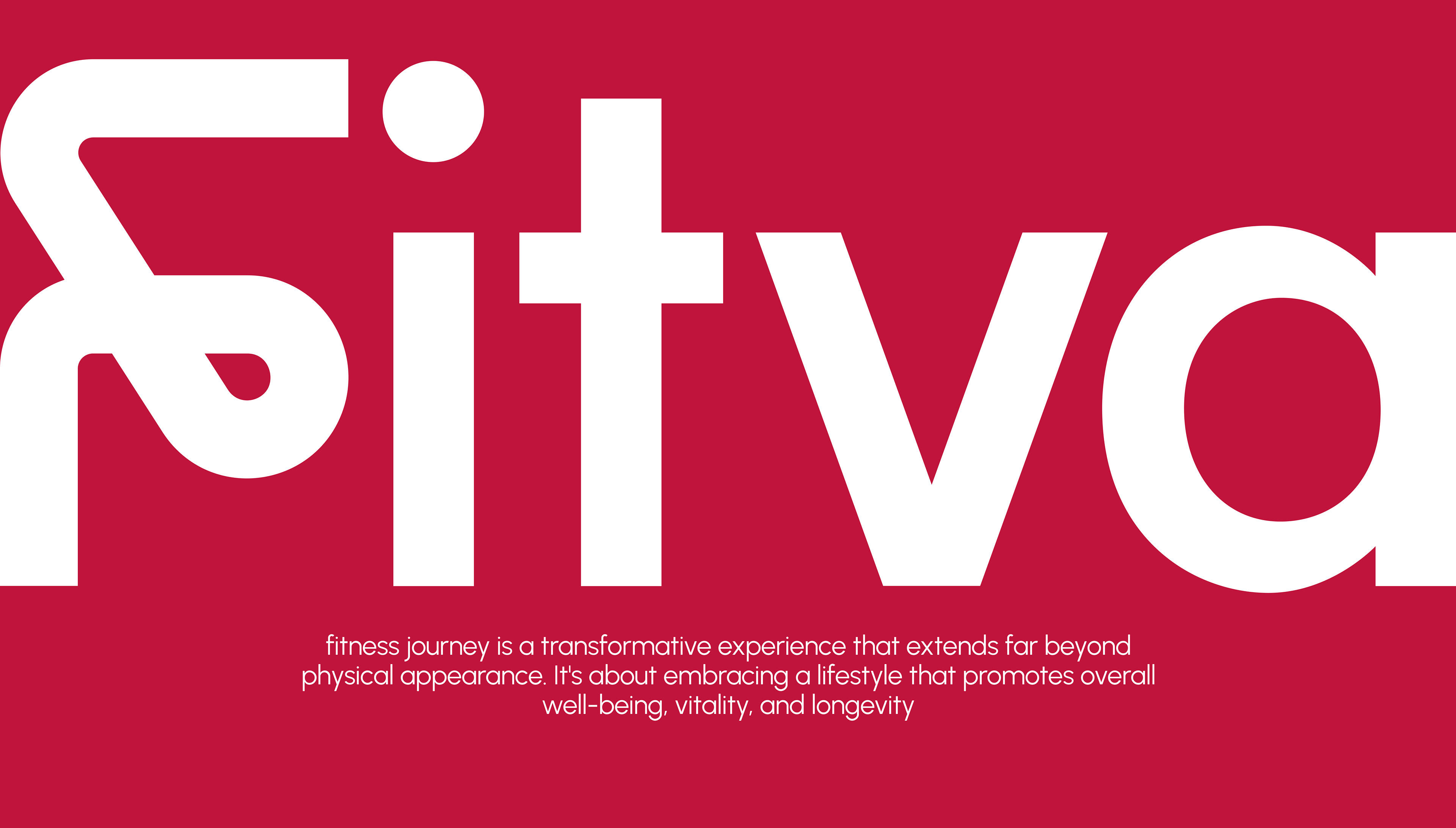
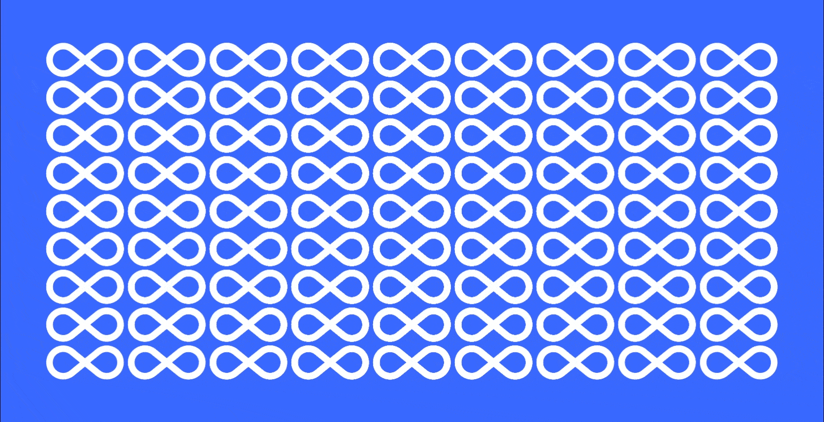
When we were creating the Fitva's logo, we focused on it's main idea: "We are what we do repeatedly" . We really thought about what Fitva is all about: doing things over and over again to get better. We wanted the logo to show that idea of things continuing endlessly. So, we decided to make a wordmark logo that uses part of the infinity loop in the letters. We made the logo look simple but still strong.
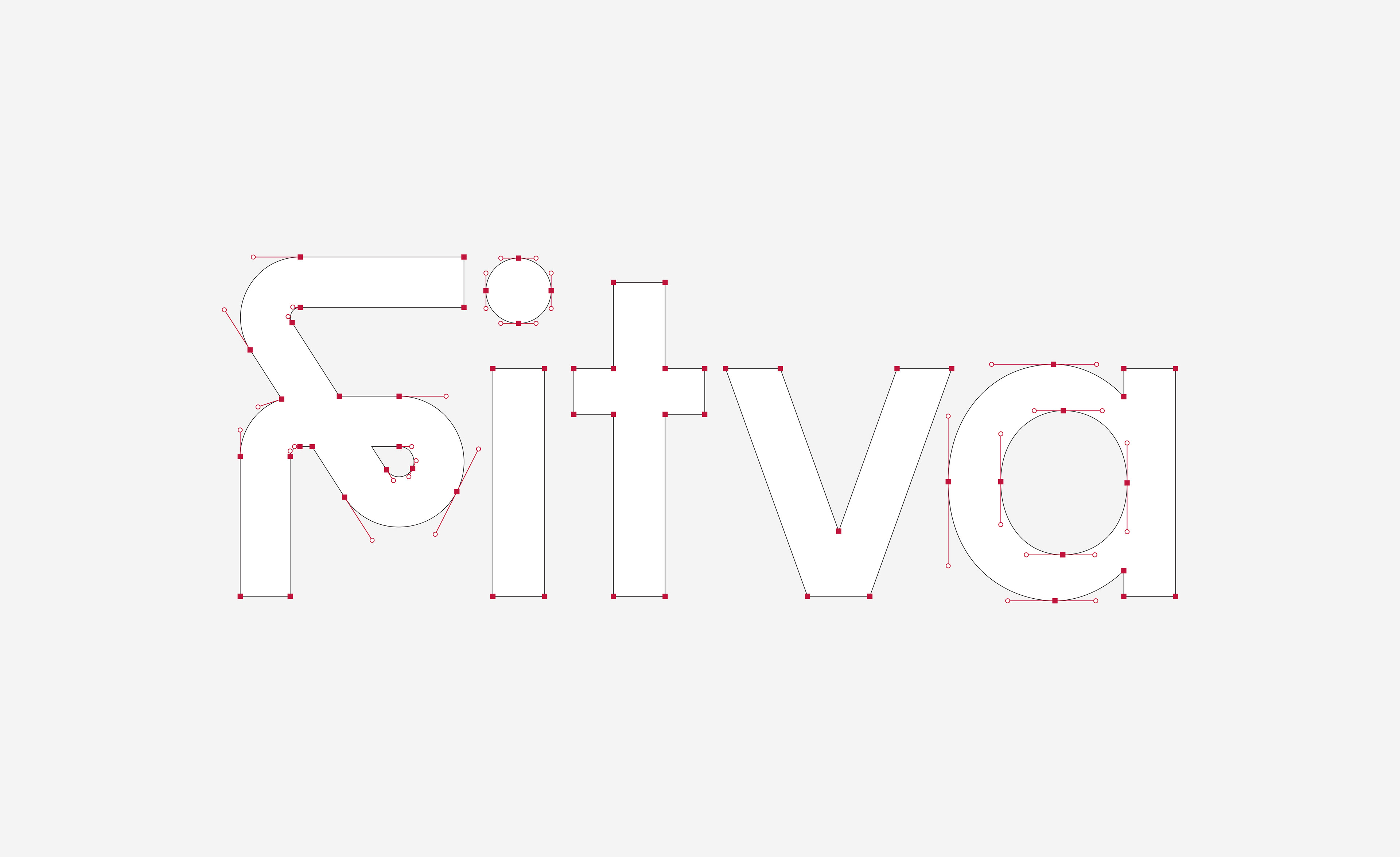

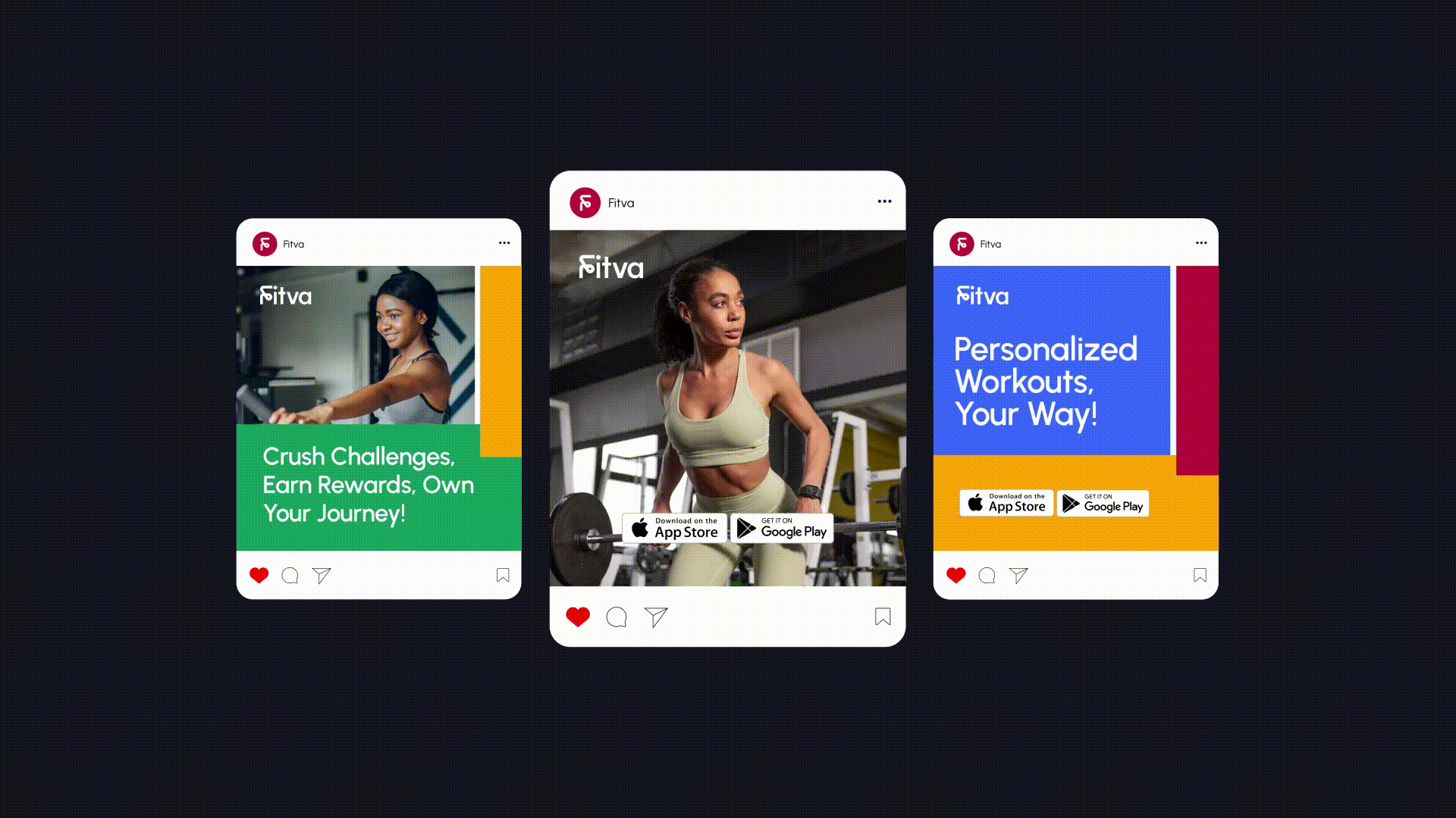
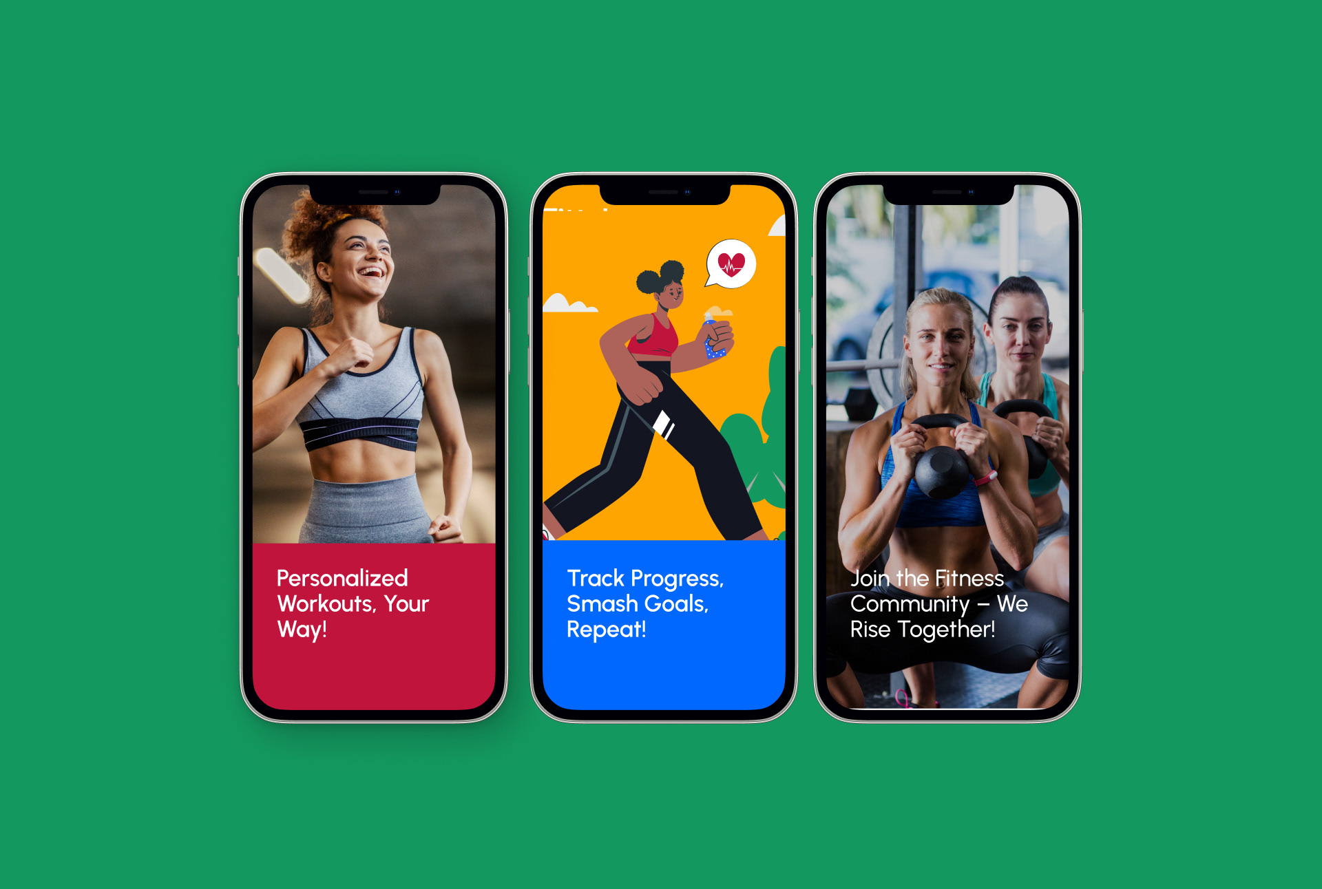
We selected Urbanist for Fitva’s typography because its modern, flexible design is built for digital environments. Its clean readability perfectly aligns with our fitness and lifestyle focus, ensuring a sleek and professional presence that helps Fitva stand out online.
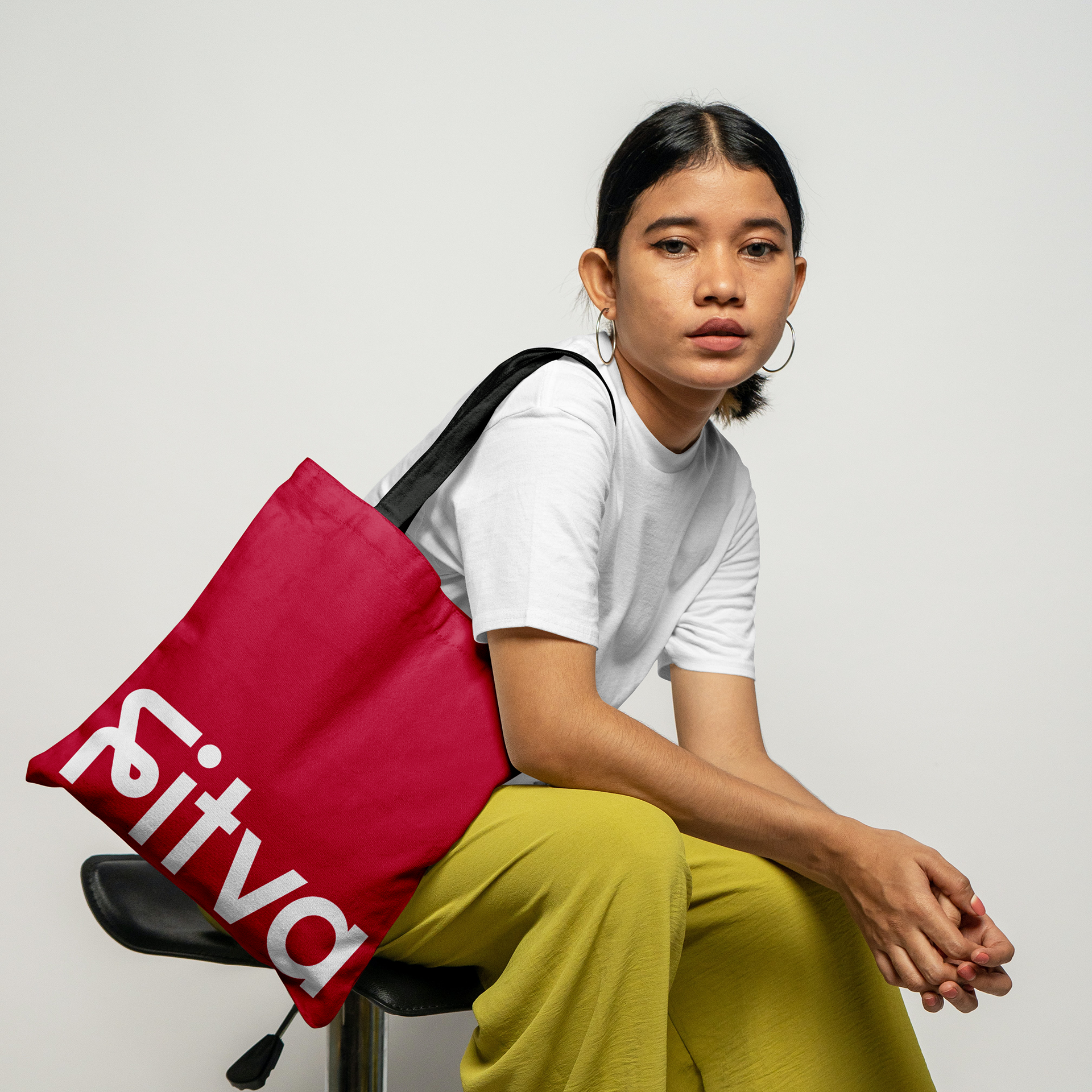
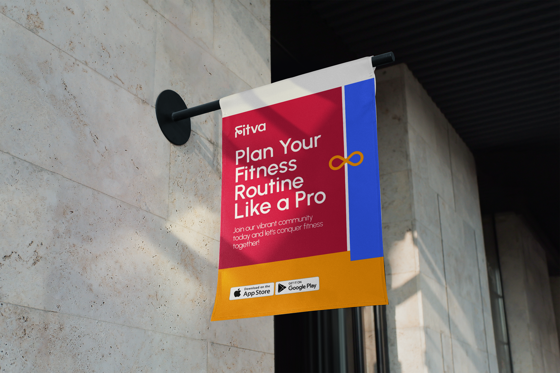
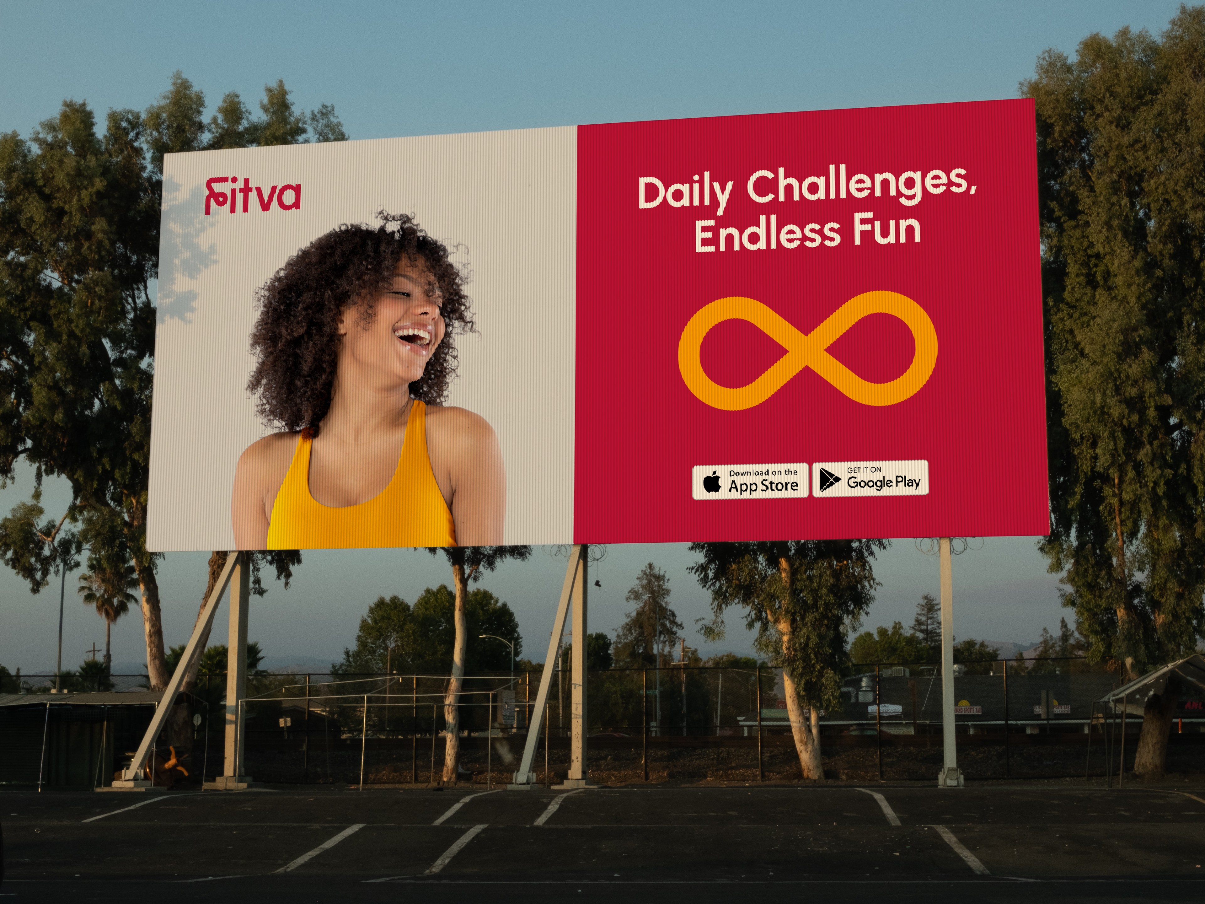
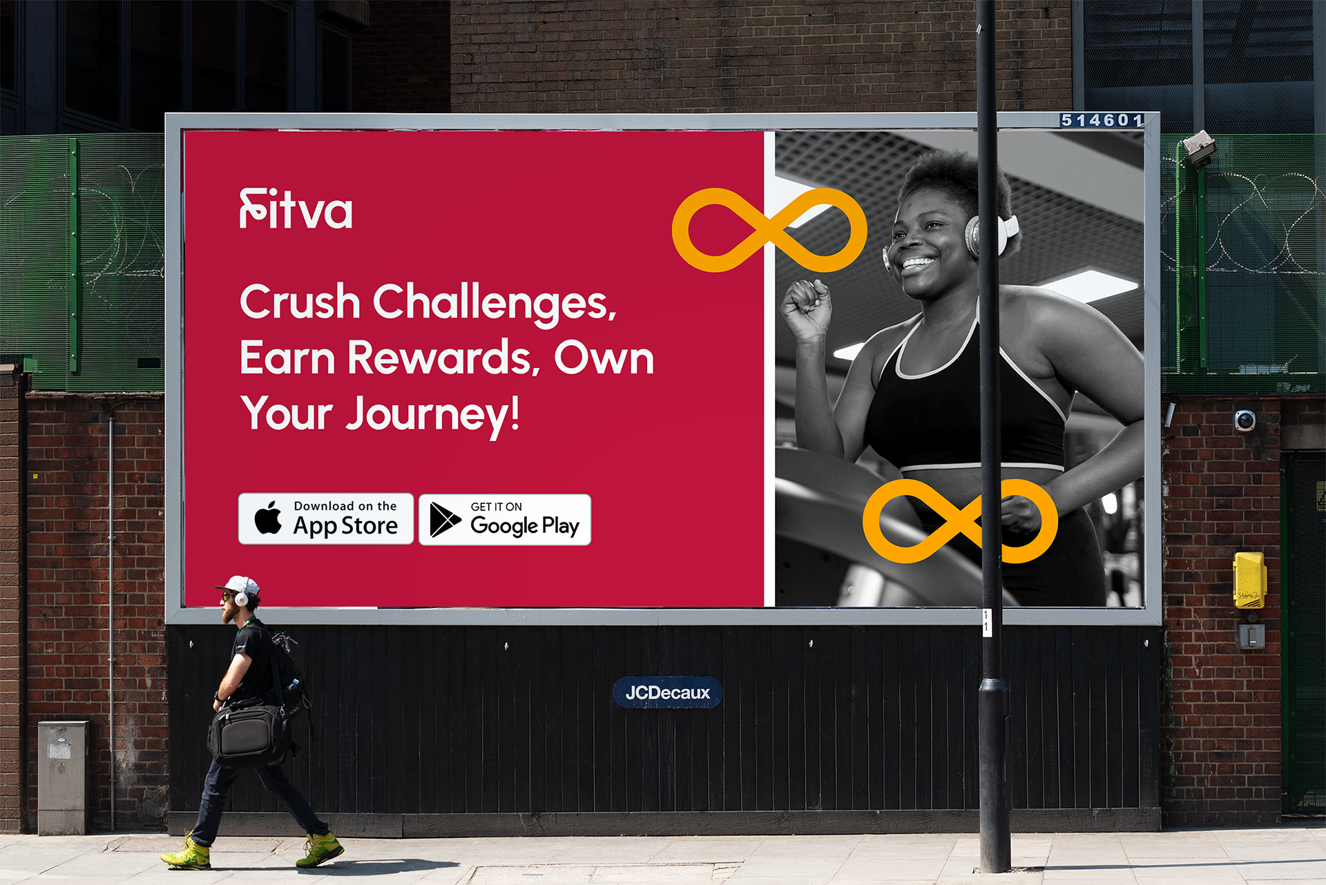
We went for a bold and lively color scheme for our project, mainly using cardinal red. We also added in colors like selective yellow, jade, neon blue, and rich black and grey. These bright colors make our visuals exciting and memorable. Cardinal red stands out the most, with the other colors helping to create a cohesive design.

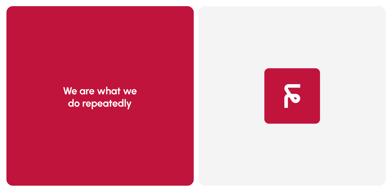
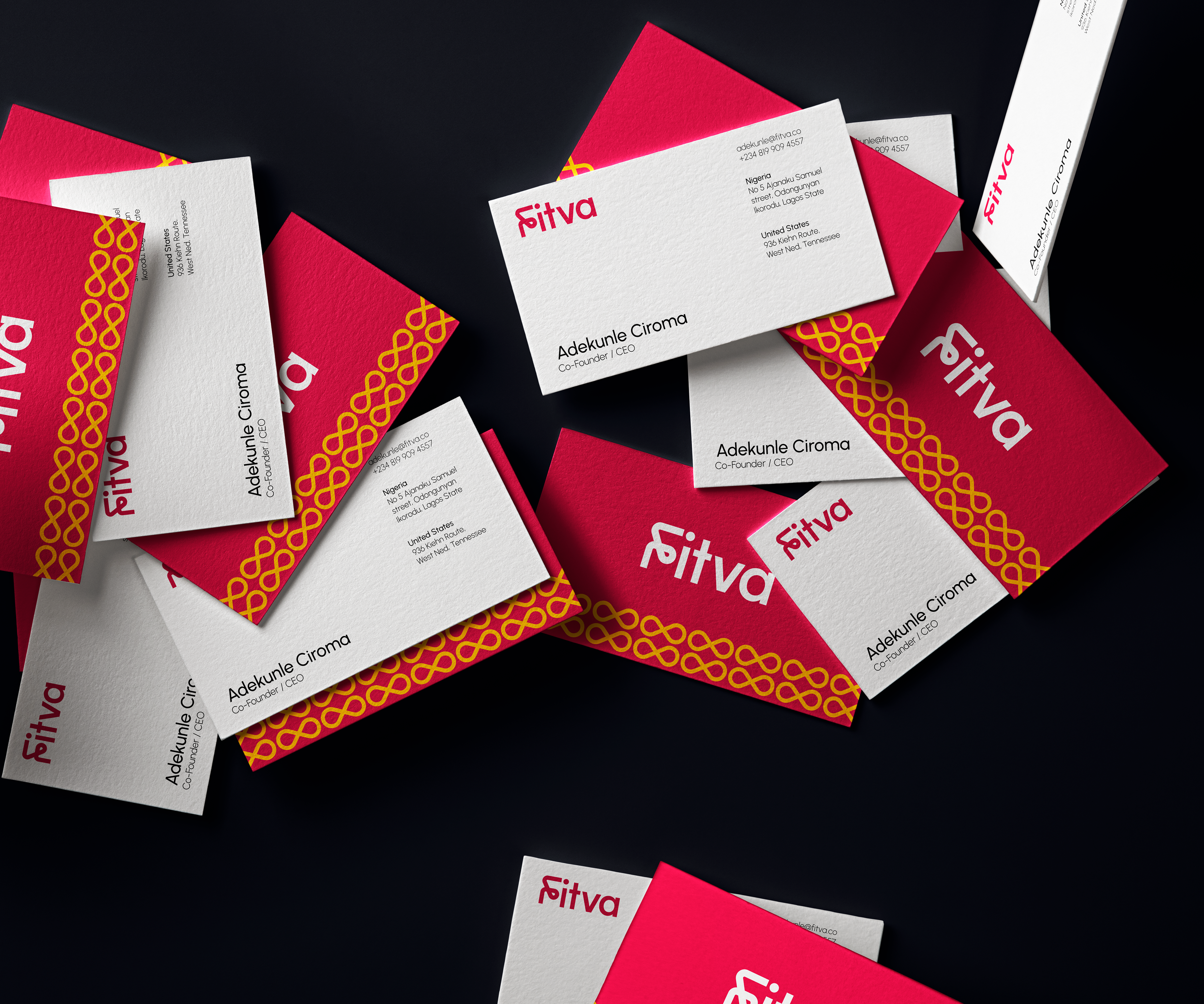
We added the infinity loop symbol when we created Fitva's brand pattern. It stands for continuous growth. This reflects Fitva's main message: "We are what we do repeatedly." In our pattern, the infinity loop shows that we're always improving and encourages people to make good daily choices. It's about sticking together, supporting one another, and aiming for a healthier and happier life within the Fitva community.
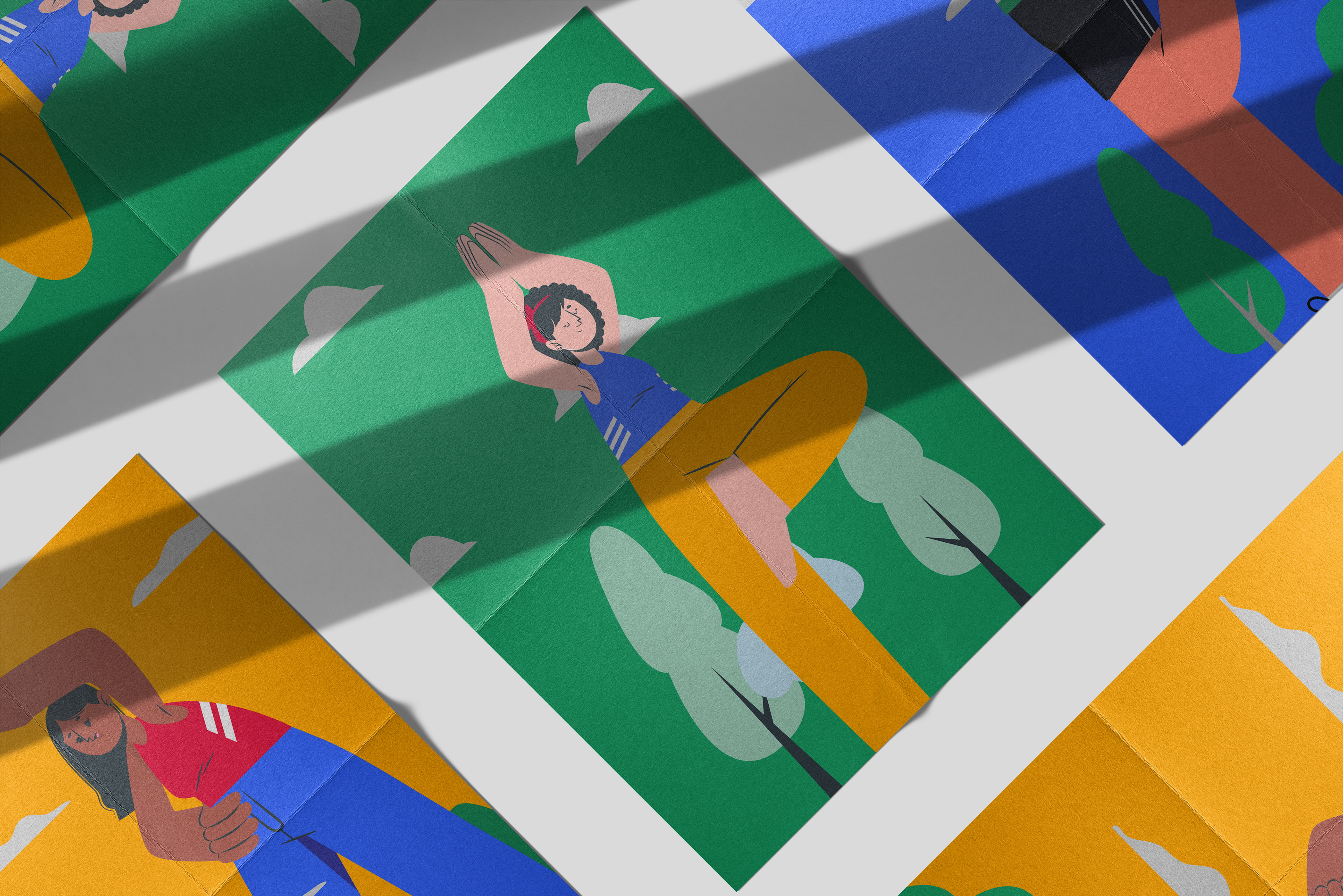
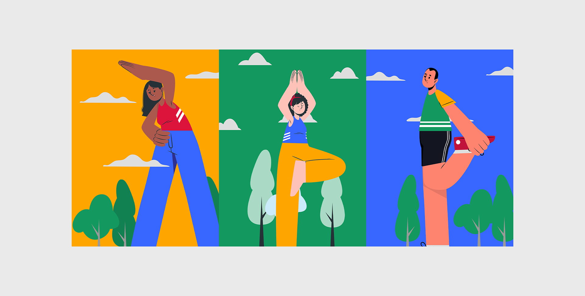
We looked into the 'Cuate' illustration style from Storyset, known for its intentional exaggeration of body parts. This distinctive style became a central focus of our project, serving as a captivating storytelling tool. The deliberate exaggeration adds energy, personality, and a unique charm to each theme we explore, making it a standout and attention-grabbing element. Our illustrations serve as a strong means of expressing the distinct essence of our creative vision, enhancing the overall narrative with engaging and visually striking imagery.
Brand Expression
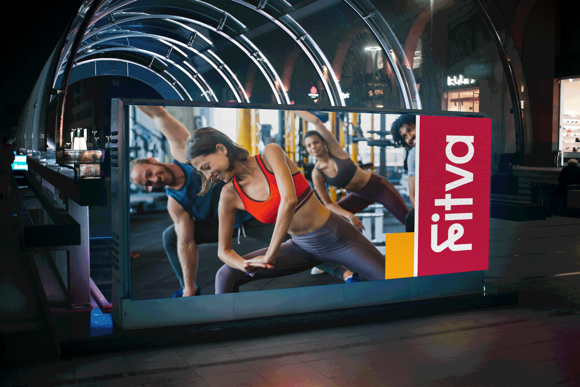
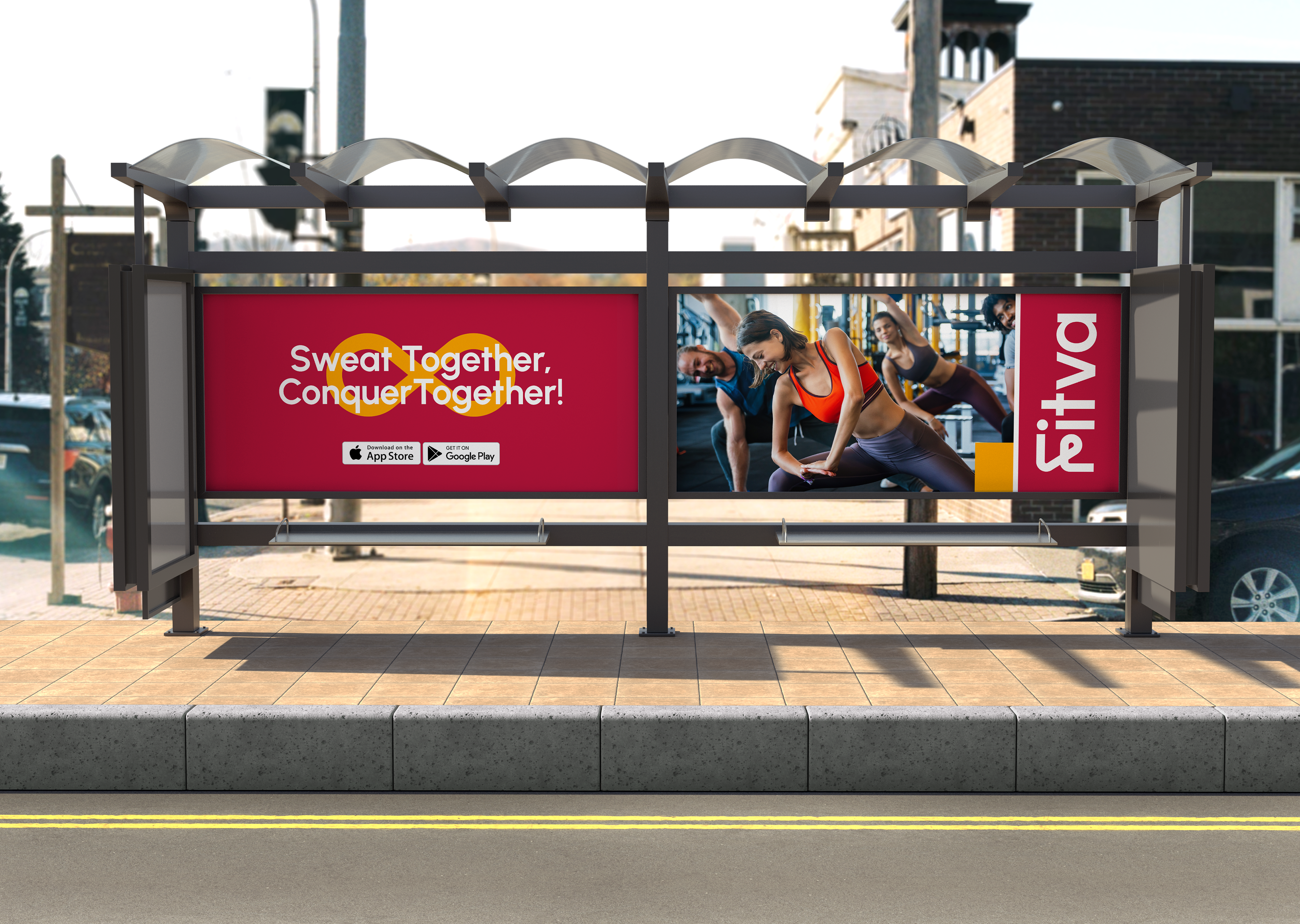
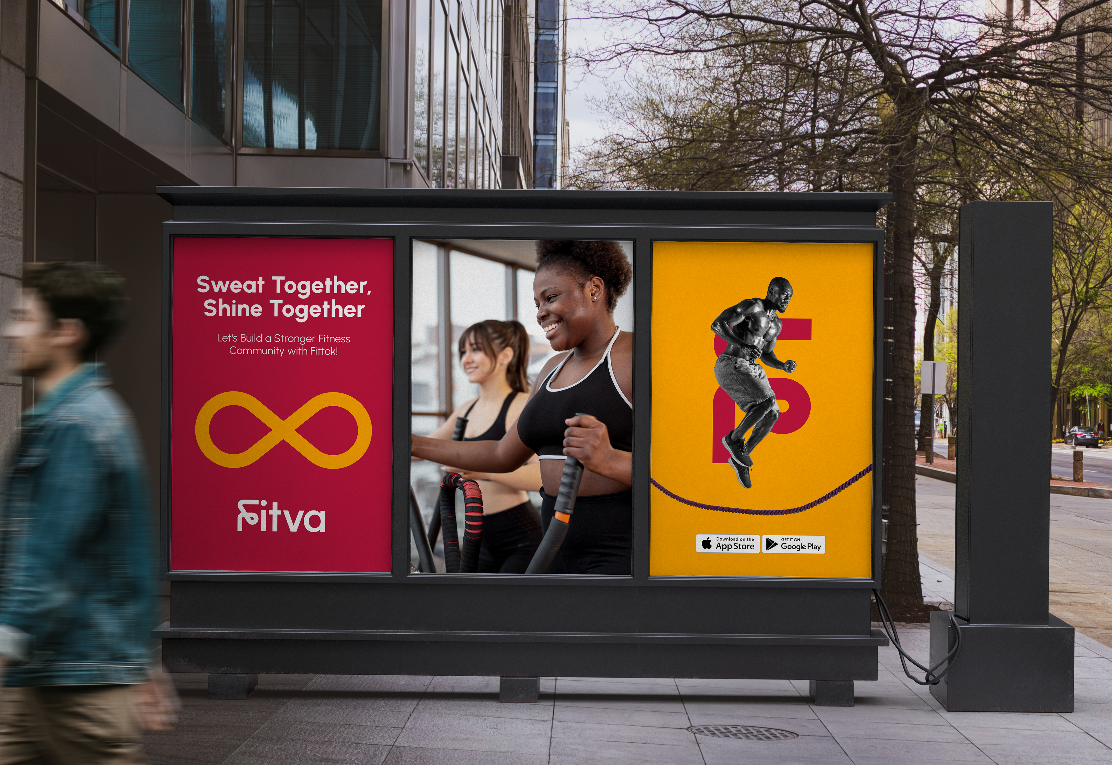
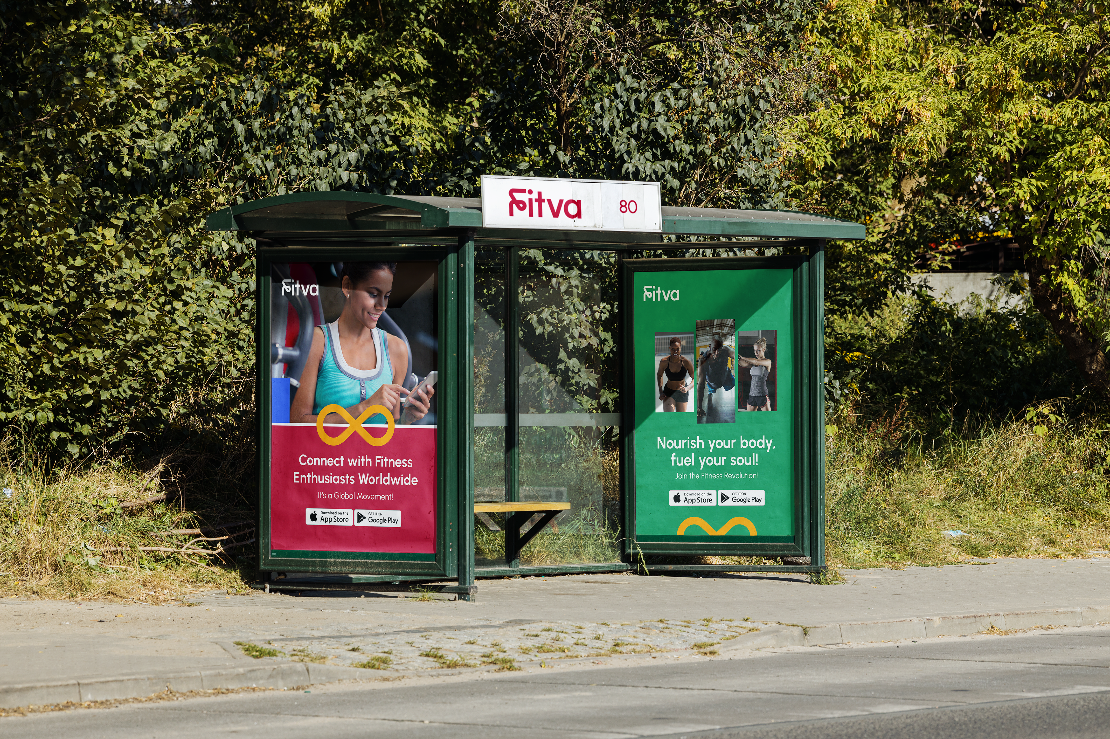
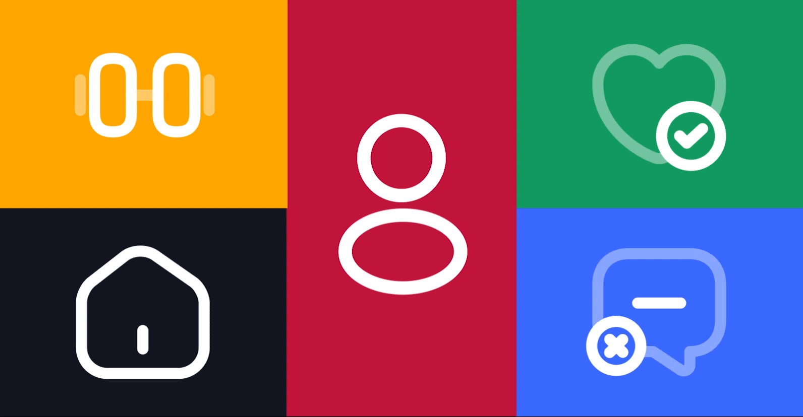
We explored Fittok's brand elements in the designs to create cohesive branding, incorporating typography, illustration, imagery, brand assets, and mockups. This exploration was particularly emphasized in out-of-home designs and social media, encompassing both digital and offline mediums.